Theme Sections
Sections are reusable UI components that sellers can customize. Section files are present inside the sections folder of a theme.
Anatomy of a Section
Sections are reusable React components that can be customized from the theme editor. Each section has a settings configuration object which is passed to the component as its props. Sections can be provided with custom props by passing props to the SectionRenderer component.
For each section, there must be a named export for Component defining the visual interface of the section and a named export for settings defining the configuration schema for the section.
Example
Example of a section that renders HTML markup in a React component.
import React from "react";

export function Component({ props, blocks }) {
  const descValue = props?.description?.value;
  if (!descValue) return null;

  return <p>{descValue}</p>;
}

export const settings = {
  label: "Section Description",
  props: [
    {
      id: "description",
      label: "Description",
      type: "text",
      default: "",
      info: "Description text of the section",
    },
  ],
  blocks: [],
};
Input Types
This section provides an overview of various input types used in our application. Each input type includes a brief description, an image of the UI component, and the settings object that defines it.
How to use
- Define the Settings: Use the provided
settingsobject as a template to define the properties (props) and their configurations. - Customize as Needed: Modify the
label,id,type,default,info, andoptionsfields to suit your requirements. - Handle the Data: In your component, access the input values like
props[id].valueand implement the necessary logic to build your components.
1. Brand
A dropdown selection for choosing a brand from the list.
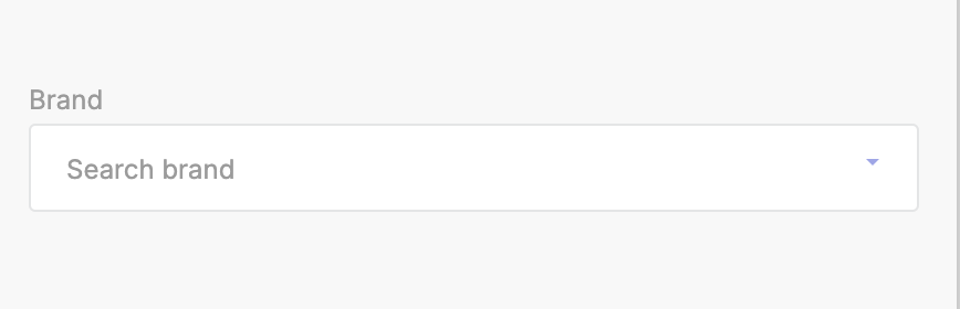
Settings Object
export const settings = {
    label: "Brand Selector",
    props: [
        {
            id: "brand",
            label: "Brand",
            type: "brand",
            default: "",
            info: "Search Brand",
        },
    ],
    blocks: [],
};
2. Category
A dropdown selection for choosing a category from the list.
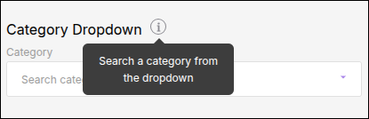
Settings Object
export const settings = {
    label: "Category Selector",
    props: [
        {
            "type": "category",
            "id": "category",
            "default": "",
            "label": "Category Dropdown",
            "info": "Search a category from the dropdown"
        }
    ],
    blocks: [],
};
3. Checkbox
A checkbox input for enabling or disabling a feature.
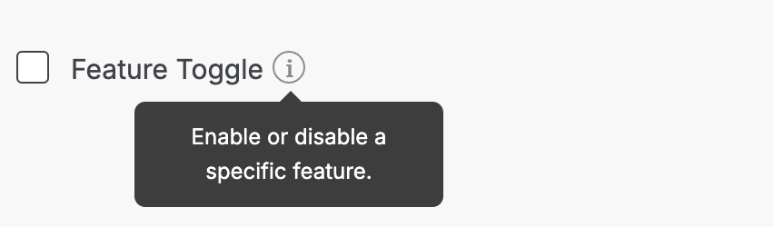
Settings Object
export const settings = {
  label: "Checkbox Input",
  props: [
    {
      id: "featureToggle",
      label: "Feature Toggle",
      type: "checkbox",
      default: false,
      info: "Enable or disable a specific feature.",
    },
  ],
  blocks: [],
};
4. Code
An input area for entering custom code or HTML.
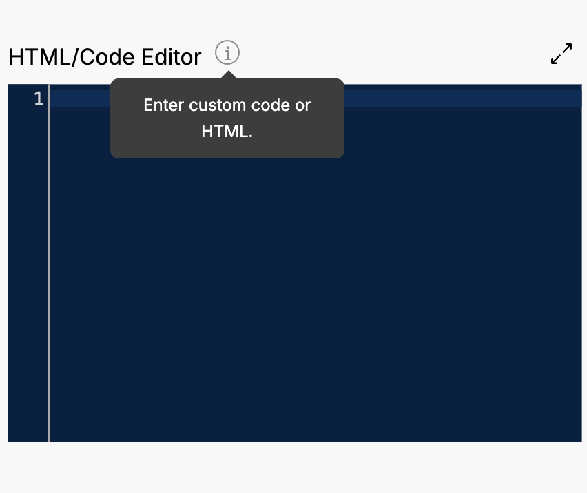
Settings Object
export const settings = {
  label: "Code Editor",
  props: [
    {
      id: "htmlCodeInput",
      label: "HTML/Code Editor",
      type: "code",
      default: "",
      info: "Enter custom code or HTML.",
    },
  ],
  blocks: [],
};
5. Collection
A dropdown selection for choosing a collection from the list.
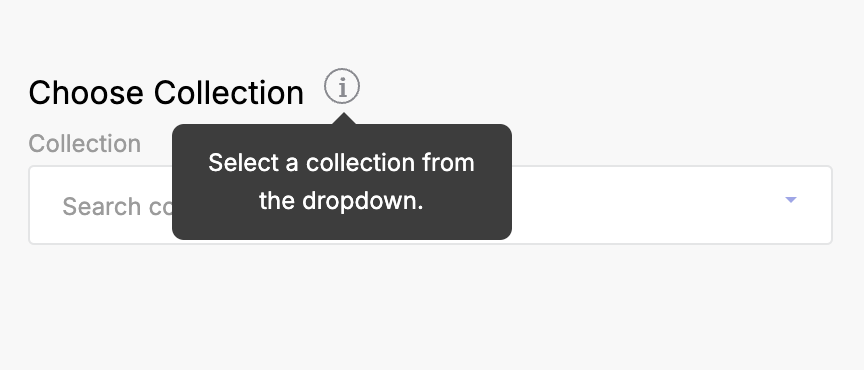
Settings Object
export const settings = {
  label: "Collection Selector",
  props: [
    {
      id: "collectionSelection",
      label: "Choose Collection",
      type: "collection",
      default: "",
      info: "Select a collection from the dropdown.",
    },
  ],
  blocks: [],
};
6. Color
A color picker for selecting a color value.
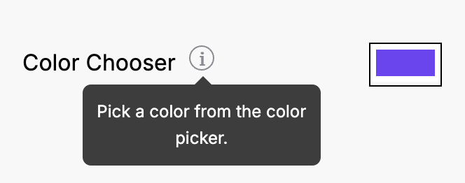
Settings Object
export const settings = {
  label: "Color Picker",
  props: [
    {
      id: "colorPicker",
      label: "Color Chooser",
      type: "color",
      default: "#7043F7",
      info: "Pick a color from the color picker.",
    },
  ],
  blocks: [],
};
7. Department
A dropdown selection for choosing a department from the list.
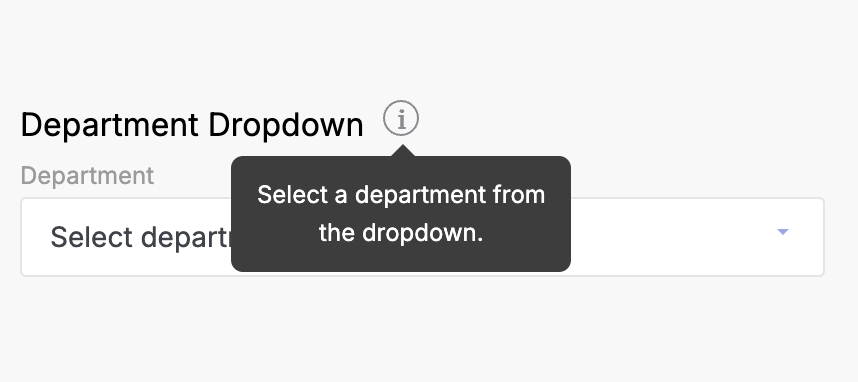
Settings Object
export const settings = {
  label: "Department Selector",
  props: [
    {
      id: "departmentSelection",
      label: "Department Dropdown",
      type: "department",
      default: "",
      info: "Select a department from the dropdown.",
    },
  ],
  blocks: [],
};
8. Font
An input for selecting font settings.
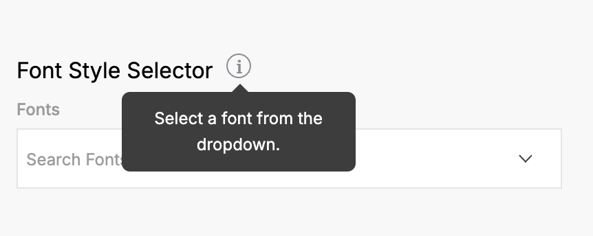
Settings Object
export const settings = {
  label: "Font Selector",
  props: [
    {
      id: "fontSelector",
      label: "Font Style Selector",
      type: "font",
      default: "Arial",
      info: "Select a font from the dropdown.",
    },
  ],
  blocks: [],
};
9. Image Picker
An interface for uploading or selecting an image.
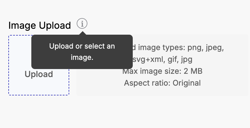
Settings Object
export const settings = {
  label: "Image Picker",
  props: [
    {
      id: "imageUploader",
      label: "Image Upload",
      type: "image_picker",
      default: "",
      info: "Upload or select an image.",
      options: {
        maxSize: 2048,
        file_types: ["png", "jpeg", "svg+xml"],
        aspect_ratio: 1,
        aspect_ratio_strict_check: false,
        min_resolution: { width: 100, height: 100 },
        max_resolution: { width: 2000, height: 2000 },
      },
    },
  ],
  blocks: [],
};
10. Range
A slider input for selecting a numerical value within a range.
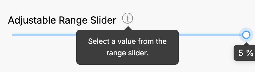
Settings Object
export const settings = {
  label: "Range Slider",
  props: [
    {
      id: "rangeSlider",
      label: "Adjustable Range Slider",
      type: "range",
      default: 5,
      info: "Select a value from the range slider.",
      min: 0,
      max: 5,
      step: 1,
      unit: "%",
    },
  ],
  blocks: [],
};
11. Select
A dropdown selection for choosing an option from a provided list.
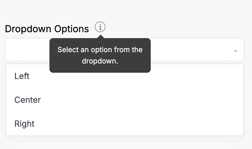
Settings Object
export const settings = {
  label: "Select Input",
  props: [
    {
      id: "dropdownSelector",
      label: "Dropdown Options",
      type: "select",
      default: "",
      info: "Select an option from the dropdown.",
      options: [
        { text: "Left", value: "L" },
        { text: "Center", value: "C" },
        { text: "Right", value: "R" },
      ],
    },
  ],
  blocks: [],
};
12. Tags List
An input that allows the user to select multiple tags from a list, with search functionality.
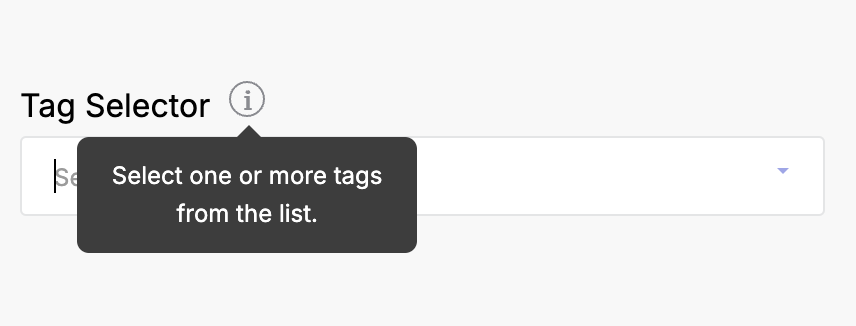
Settings Object
export const settings = {
  label: "Tags List",
  props: [
    {
      id: "tagsPicker",
      label: "Tag Selector",
      type: "tags-list",
      default: [],
      info: "Select one or more tags from the list.",
    },
  ],
  blocks: [],
};
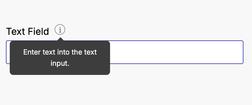
13. Text
A single-line text input for entering short text, such as names or titles.
Settings Object
export const settings = {
  label: "Text Input",
  props: [
    {
      id: "textInput",
      label: "Text Field",
      type: "text",
      default: "",
      info: "Enter text into the text input.",
    },
  ],
  blocks: [],
};
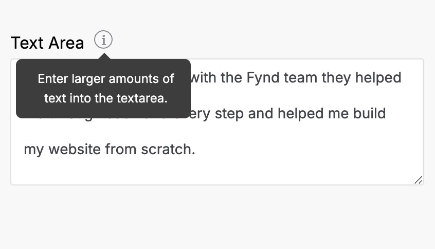
14. Text Area
A multi-line text input for entering larger amounts of text.
Settings Object
export const settings = {
  label: "Textarea Input",
  props: [
    {
      id: "multilineText",
      label: "Text Area",
      type: "textarea",
      default:
        "It was amazing working with the Fynd team they helped me through each and every step and helped me build my website from scratch.",
      info: "Enter larger amounts of text into the textarea.",
    },
  ],
  blocks: [],
};
15. URL
An input for entering or building URLs.
Settings Object
export const settings = {
  label: "URL Input",
  props: [
    {
      id: "urlInput",
      label: "URL Field",
      type: "url",
      default: "",
      info: "Enter or build a URL.",
    },
  ],
  blocks: [],
};
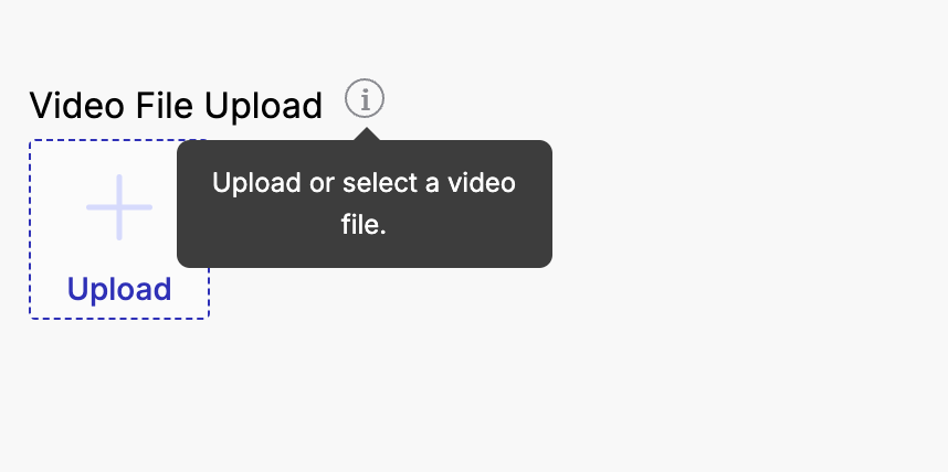
16. Video
An input for uploading or selecting a video file.
Settings Object
export const settings = {
  label: "Video Input",
  props: [
    {
      id: "videoUploader",
      label: "Video File Upload",
      type: "video",
      default: "",
      info: "Upload or select a video file.",
      options: {
        fileTypes: ["mp4"],
      },
    },
  ],
  blocks: [],
};
17. Action URL
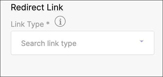
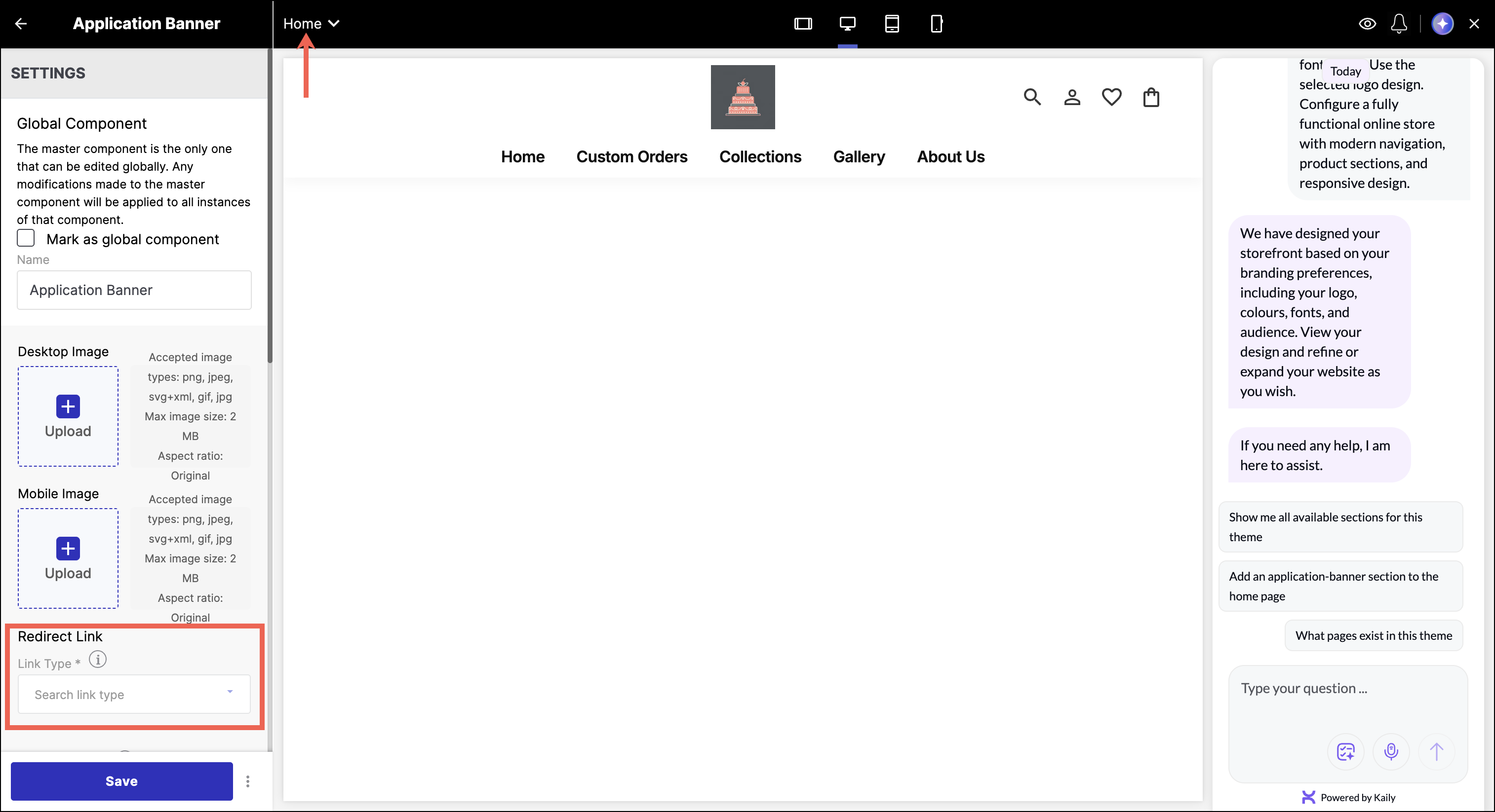
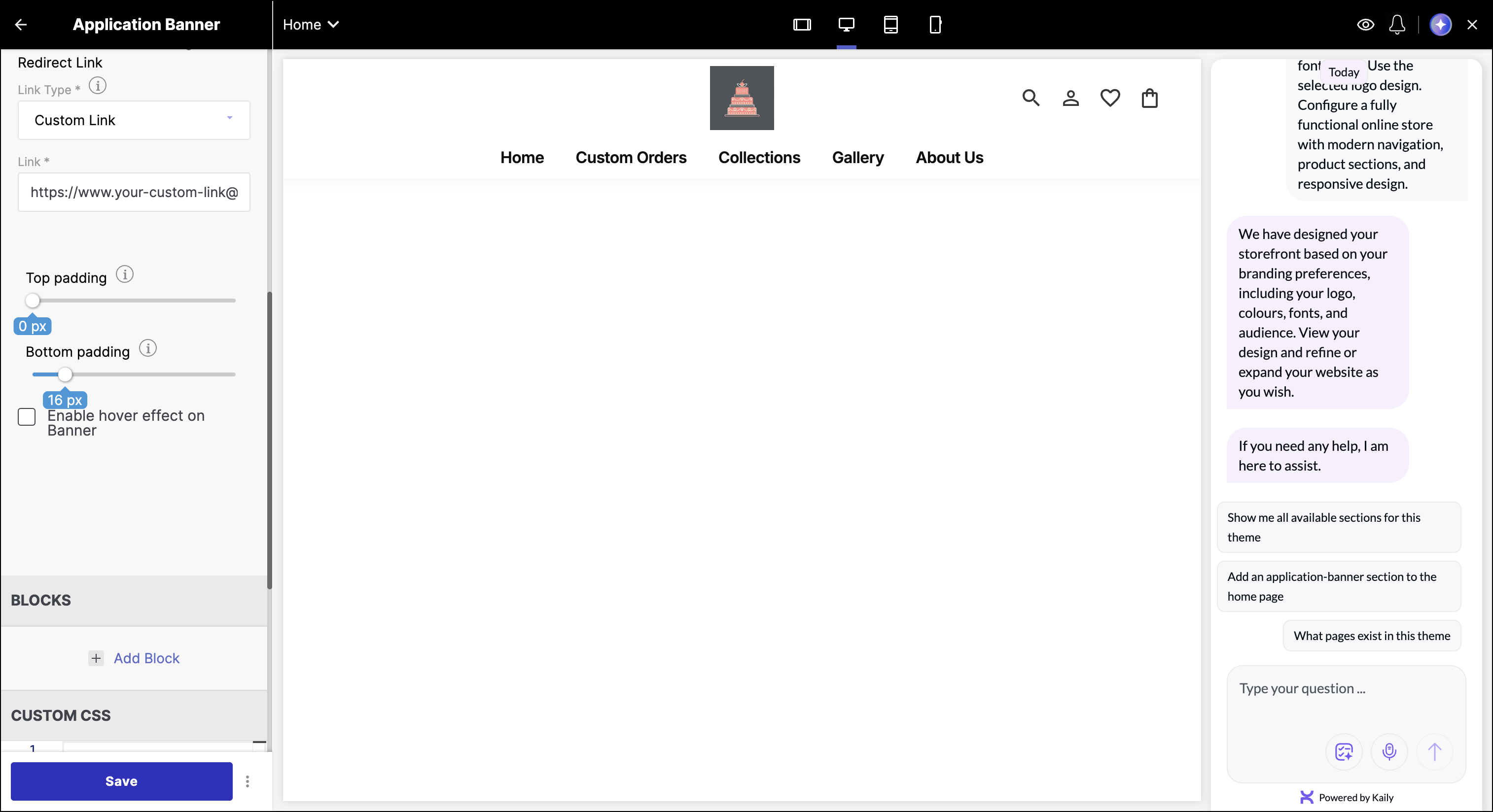
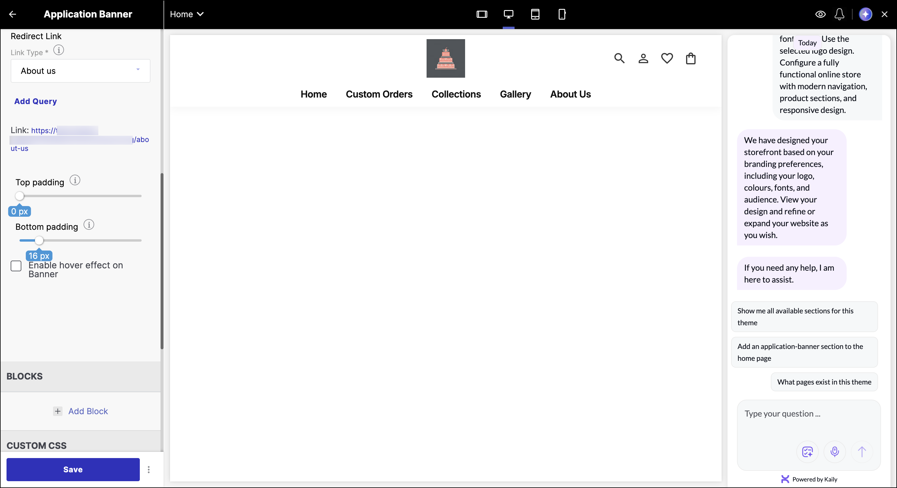
The Action URL (action_url) input type is designed for linking to a wide range of navigation targets within your store or to any external URL.
Settings Object
Here's how you can add an action_url prop in your section settings.
export const settings = {
  label: "Action URL Input",
  props: [
    {
      id: "urlInput",
      label: "Redirect Link",
      type: "action_url",
      default: {},
      info: "Type of link to generate action/URL", //tooltip
    },
  ],
  blocks: [],
};
The following image illustrates the Action URL input in the theme editor:
Typical Example
You can verify the API response by inspecting the Network tab → Response in your browser's developer console.
The value of an action_url prop is an object. This object can contain information about the target page, query parameters, path, and type of navigation.
The typical response in the developer's console appears in the following way:
{
  "_id": "12a34567a171380d4c8e6abc",
  "value": "home",
  "text": "Home",
  "path": "",
  "type": "system",
  "sections": [
    {
      "name": "application-banner",
      "label": "Application Banner",
      "props": {
        "banner_link": {
          "type": "action_url",
          "value": {
            "page": {
              "params": {},
              "query": {},
              "type": null,
              "url": ""
            },
            "type": "page"
          }
        }
      }
    }
  ]
}
Example Scenarios
Below are multiple usage scenarios to help you understand how different link selections are represented in the API response.
- If the seller selects the Home page and enters a custom URL link in the theme editor page.
{
  "_id": "12a34567a171380d4c8e6abc",
  "value": "home",
  "text": "Home",
  "path": "",
  "type": "system",
  "sections": [
    {
      "name": "application-banner",
      "label": "Application Banner",
      "props": {
        "banner_link": {
          "type": "action_url",
          "value": {
            "page": {
              "query": {
                "url": ["https://your-custom-link@abc.com"]
              },
              "type": "external",
              "url": "/external/?url=https%3A%2F%2Fyour-custom-link%40abc.com"
            },
            "type": "page"
          }
        }
      }
    }
  ]
}
- When the seller selects Home → About us page:
{
  "_id": "12a34567a171380d4c8e6abc",
  "value": "home",
  "text": "Home",
  "path": "",
  "type": "system",
  "sections": [
    {
      "name": "application-banner",
      "label": "Application Banner",
      "props": {
        "banner_link": {
          "type": "action_url",
          "value": {
            "page": {
              "params": {},
              "query": {},
              "type": "about-us",
              "url": "/about-us"
            },
            "type": "page"
          }
        }
      }
    }
  ]
}
How to Use Action URLs in Components
You can use the action_url in two main ways:
- Using
FDKLink
Pass the entire action object to the FDKLink component. This code renders an FDKLink component, which is a custom link component likely provided by the FDK-core package.
<FDKLink action={urlInput?.value}>{{ link_text }}</FDKLink>
- Using Anchor Tags
If you need to render a standard <a> tag, convert the action object to a URL string using the convertActionToUrl helper from FDK:
import { convertActionToUrl } from "@gofynd/fdk-client-javascript/sdk/common/Utility";
<a href={convertActionToUrl(urlInput?.value)}>Your Link Text</a>
Props
Props are used to configure the look and feel of sections. Section template can access the props with settings.props.
Each prop is an object with various fields explained below:
| Props | Description |
|---|---|
| settings.props.[prop_id].value | Returns the value of the prop id. |
| settings.props.[prop_id].default | Returns the default value of the prop |
| settings.props.[prop_id].type | Returns the type of the prop. It is used in the Theme editor to show various input types, such as text, color, range, checkbox, product, brand, collection, html, image & video. Refer to Input Type. |
| settings.props.[prop_id].label | Returns the label for the prop. |
| settings.props.[prop_id].info | Returns info of the prop. This info is used in the tooltip of the Theme editor. |
Example
export const settings = {
    label: 'Raw HTML',
    props: [
        {
            id: 'code',
            label: 'Your Code Here',
            type: 'code',
            default: '',
            info: 'Add Your custom HTML Code below. You can also use the full screen icon to open a code editor and add your code',
        },
    ],
    blocks: [],
};
Settings Object
The settings object lets you access a section's properties and setting values.
| Object | Description |
|---|---|
| settings.name | Returns the name of the section. |
| settings.label | Returns the label of the section. |
| settings.props | Returns an object of all the props. More about props. |
| settings.blocks | Returns an array of section blocks. More about Blocks. |
| settings.preset | Returns an array of section presets. This can be used to set a default value for blocks. |
Example
export const settings = {
  label: "Swipe Gallery",
  blocks: [
    {
      label: "Image card",
      type: "gallery",
      props: [
        {
          id: "url",
          label: "Banner Image Link",
          type: "text",
          default: "",
          info: "Link to the image that should be displayed in banner",
        },
        {
          id: "alt",
          label: "Alt Text",
          type: "text",
          default: "Image Alt",
          info: "Image Alt",
        },
        {
          id: "width",
          label: "Image Width",
          type: "text",
          default: "100",
          info: "Width of image in %",
        },
      ],
    },
  ],
  props: [
    {
      id: "title",
      label: "Title",
      type: "text",
      default: "",
      info: "Link to the image that should be displayed in banner",
    },
  ],
};
Section Code Splitting
Section Code Splitting is a technique where individual sections are split into smaller code bundles and loaded only when required. This improves performance, especially in storefronts with many dynamic sections.
Refer to Section Code Splitting to learn how to implement it.