Home Page
The home page is the primary entry point for users visiting a website or application. It provides an overview and directs users to other sections or pages. The content may vary depending on the type of website or application, but typically includes a logo, navigation menu, hero section, featured content, and key feature sections.
Since the Home page is the first impression users have of a website or application, it's crucial to design it to be visually appealing, easy to navigate, and effectively communicate the website or application's value proposition.
Application Banner
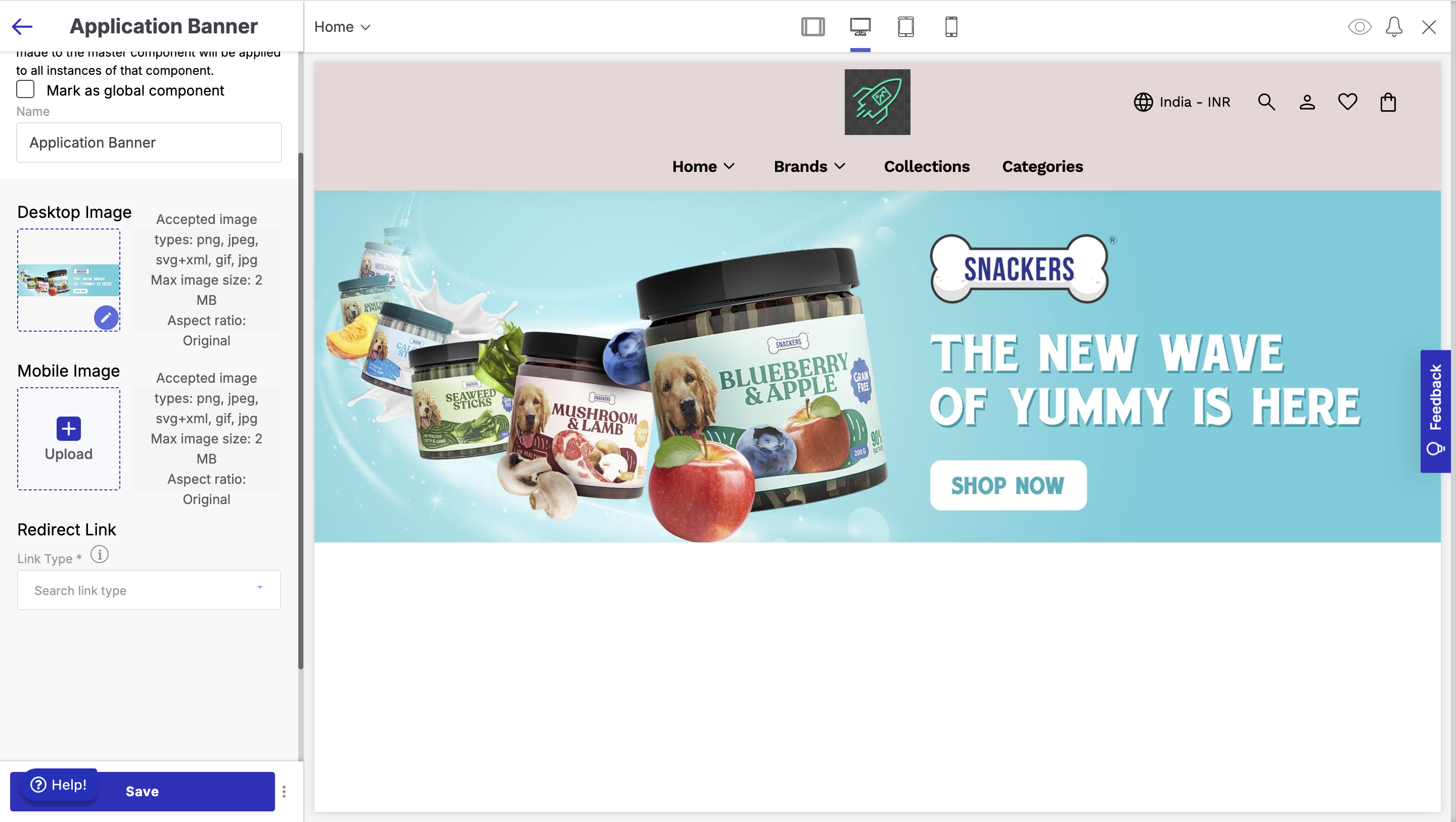
The Application Banner is a large image that appears on your storefront's homepage to grab visitors' attention. This banner helps showcase key promotions, new arrivals, or important messages in a visually appealing way!
- Go to the appearance section of your theme and select 'Edit'.
- Click on 'Add Section' below the list of other sections on the left side of the screen.
- Select 'Application Banner' from the left sidebar.
Below are the configurable options:
- Desktop Image: Application banner image for desktop screens.
- Mobile Image: Application banner image for mobile screens.
- Redirect Link: Link to which customer is to be redirected to when the user clicks on the application banner image.
- Block
- Hotspot Desktop: Displays clickable hotspots on desktop view to highlight specific areas of an image or section for enhanced interactivity and engagement.
- Pointer: The pointer shape to be a circle pointer or a box
- Show Clickable Area: Whether the clickable area to be shown or not
- Horizontal Position: Set the horizontal position of the pointer on the banner image
- Vertical Position: Set the vertical position of the pointer on the banner image
- Width: Width of the box pointer as a measure of the banner width. Only applicable for box pointer type
- Height: Height of the box pointer as a measure of the banner height. Only applicable for box pointer type
- Hotspot Hover Image: Image to be displayed when the user hovers over the pointer. Only applicable for circular pointer type
- Headers: Heading to be displayed when the user hovers on the hotspot. Only applicable for circular pointers
- Description: Description to be displayed when the user hovers on the hotspot. Only applicable for circular pointers
- Hover Link Text: Hover Link text to be displayed when the user hovers on the hotspot. Only applicable for circular pointers
- Redirect Link: Redirect link to which the customer is redirected to when the user clicks on the hotspot. Only applicable for circular pointers.
- Hotspot Mobile: Displays clickable hotspots on mobile view to highlight specific areas of an image or section for enhanced interactivity and engagement
- Pointer: The pointer shape to be a circle pointer or a box
- Show Clickable Area: Whether the clickable area to be shown or not
- Horizontal Position: Set the horizontal position of the pointer on the banner image
- Vertical Position: Set the vertical position of the pointer on the banner image
- Width: Width of the box pointer as a measure of the banner width. Only applicable for box pointer type
- Height: Height of the box pointer as a measure of the banner height. Only applicable for box pointer type
- Hotspot Hover Image: Image to be displayed when the user hovers over the pointer. Only applicable for circular pointer type
- Headers: Heading to be displayed when the user hovers on the hotspot. Only applicable for circular pointers
- Description: Description to be displayed when the user hovers on the hotspot. Only applicable for circular pointers
- Hover Link Text: Hover Link text to be displayed when the user hovers on the hotspot. Only applicable for circular pointers
- Redirect Link: Redirect link to which the customer is redirected to when the user clicks on the hotspot. Only applicable for circular pointers.
- Hotspot Desktop: Displays clickable hotspots on desktop view to highlight specific areas of an image or section for enhanced interactivity and engagement.
Categories Listing
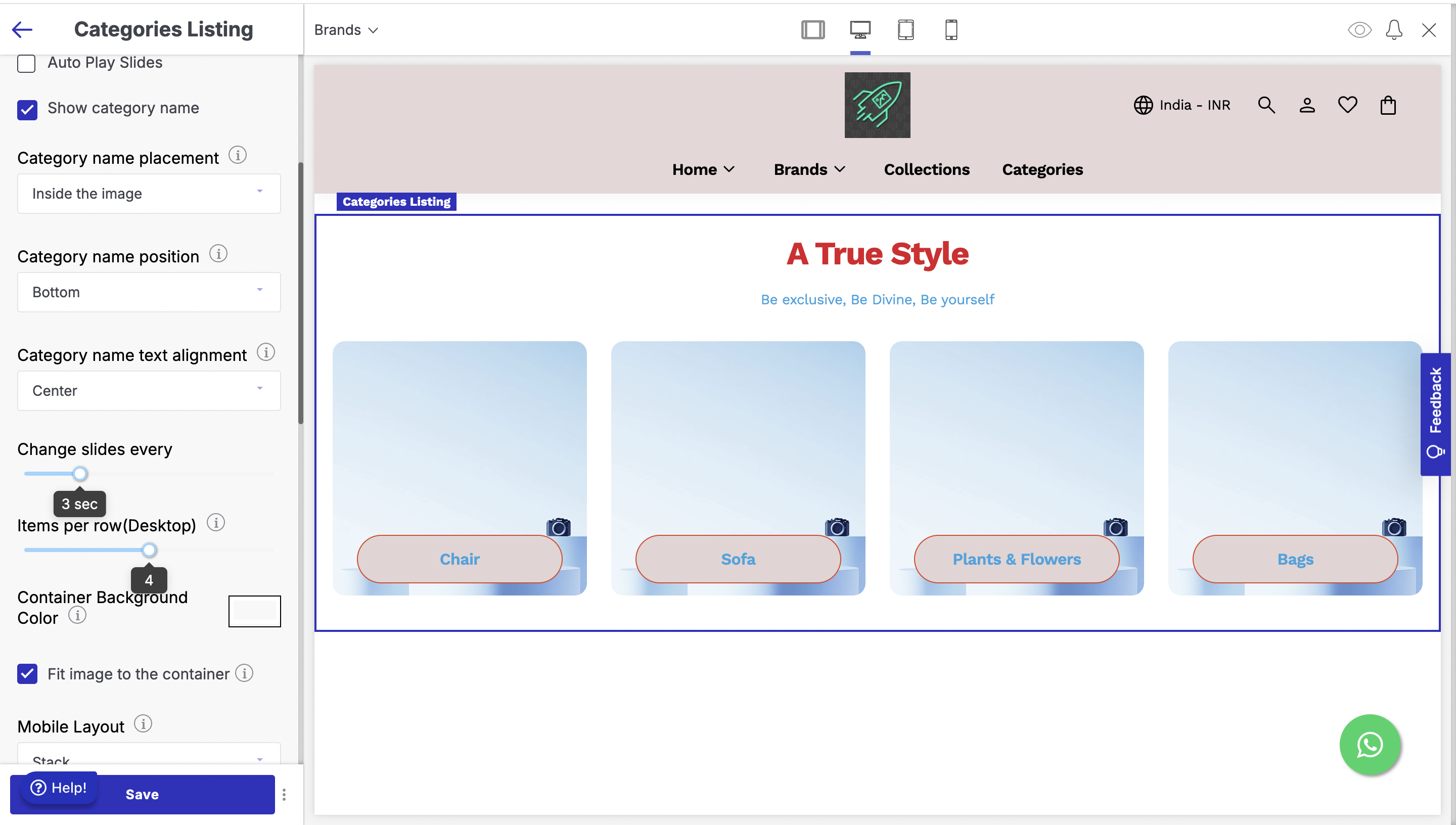
The Categories Listing section helps display different product categories on your storefront in a structured and visually appealing way.
- Go to the appearance section of your theme and select 'Edit'.
- Click on 'Add Section' below the list of other sections on the left side of the screen.
- Select 'Categories Listing' from the left sidebar.
Below are the configurations available
- Autoplay Slides: Autoplay the categories card to show the entire list of categories.
- Show Category Name: Show the category name on the category card.
- Category Name Placement: Select whether the category name needs to be displayed within the image or outside it.
- Category Name Position: Select the vertical position of the category name inside the container - whether it needs to be top aligned, center aligned or bottom aligned.
- Category Name Text Alignment: Align the category name horizontally in the container to the left, right or center of the container.
- Change Slides Every: Set the time limit after which autoplay of the category needs to happen.
- Items per row (Desktop): Select the category cards to be displayed per row in desktop screens.
- Container Background Color: Select the color of the background container of the category card.
- Fit Image to the container: Fit Image to the Container.
- Mobile Layout: Select the layout in mobile screens whether it needs to be stack or horizontal scroll.
- Desktop Layout: Select the layout in desktop screens whether it needs to be stack or horizontal scroll.
- Heading: Heading which gets displayed in the section.
- Description: Description which gets displayed in the section.
- Button Text: Text to be displayed on the button on the category card.
- Block: Select the department whose categories need to be displayed.
Collection Highlights
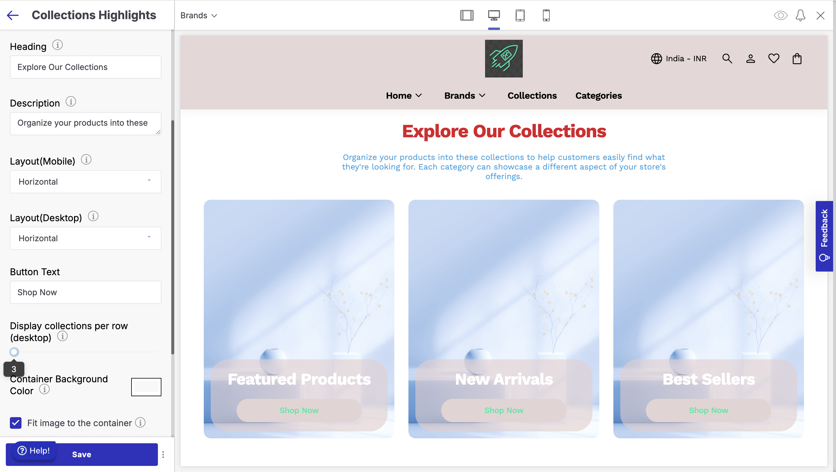
The Collections Highlights section helps you display different product collections on your storefront in an organized and customizable way.
- Go to the appearance section of your theme and select 'Edit'.
- Click on 'Add Section' below the list of other sections on the left side of the screen.
- Select 'Collection Highlights' from the left sidebar.
Below are the configurations available:
- Heading: Heading which is displayed above the Collection cards in the section.
- Description: Description which is displayed above the Collection cards in the section.
- Layout (Mobile): Select the layout for mobile screens - stack or horizontal.
- Layout (Desktop): Select the layout for desktop screens - stack or horizontal.
- Button Text: Text to be displayed on the button on the Collection card.
- Display Collections per Row (Desktop): Set the number of collection cards per row to be displayed on desktop screens.
- Container Background Colour: Set the background of the container for the Collection cards.
- Fit Image to Container: Fit Image to Container.
- Blocks
- Collection Item: Select the collection whose card is to be displayed.
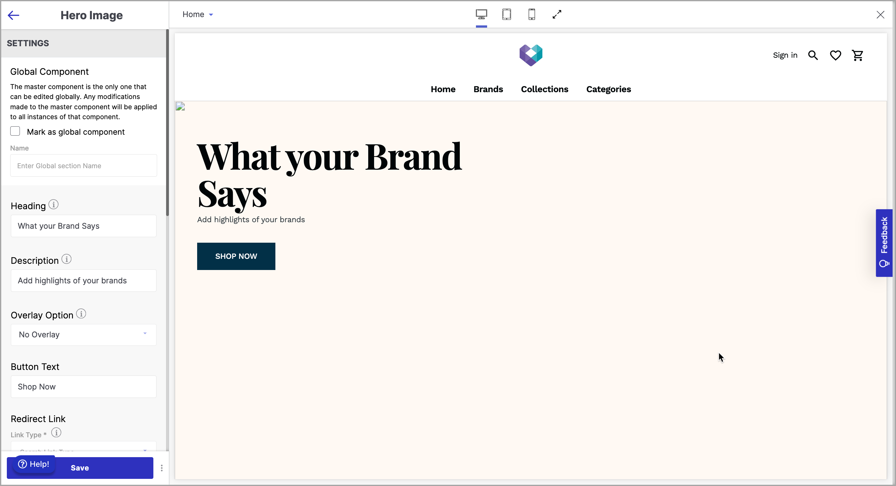
Hero Image
A hero image is a striking visual element at the top of a website's Home page. Its purpose is to capture user's attention and convey the website or application's main message or value proposition in a visually compelling way. To add a hero image section to your website:
- Go to the appearance section of your theme and select 'Edit'.
- Click on 'Add Section' below the list of other sections on the left side of the screen.
- Select 'Hero Image' from the left sidebar.
Below are the configurable options of the hero image section:
- Heading: The Heading of a Hero Image is a text element that is typically placed on top of the image in the Hero section of a website's Home page. It is a short and catchy text element that conveys the website's main message or value proposition to visitors.
- Description: The Description of a Hero Image is a text element that is typically placed below the Heading in the Hero section of a website's Home page. It usually consists of a short paragraph that provides additional information about the website's main offering, product, or service.
- Overlay Option: The Overlay Option of a Hero Image is a design feature that allows website designers to add a semi-transparent layer of black or white colour on top of the image in the Hero section of a website's Home page.
- Button Text: The Button Text of a Hero Image is a text element that is typically placed on the Hero section of a website's Home page, usually below the Description text. The purpose of the Button Text is to provide a clear call to action that prompts the visitor to take the desired action. Some examples of button text are “Learn More” “Buy Now” “Get Started” etc.
- Redirect Link: Redirect Link refers to a hyperlink that is attached to the Button Text. When a website visitor clicks on the Button Text, they will be redirected to a specific webpage or URL attached to it.
- Invert Button Colour: The "Invert Button Colour" toggle button is a feature that allows you to toggle the colour of the button. When the button is toggled on, hovering over the button will invert the colour of the button. This feature is useful for users who have difficulty reading text on certain background colours, as it allows them to easily switch between different colour schemes.
- Desktop Banner: A desktop banner is a graphic or visual advertisement that appears on a computer screen in a fixed position, typically at the top or bottom of the screen.
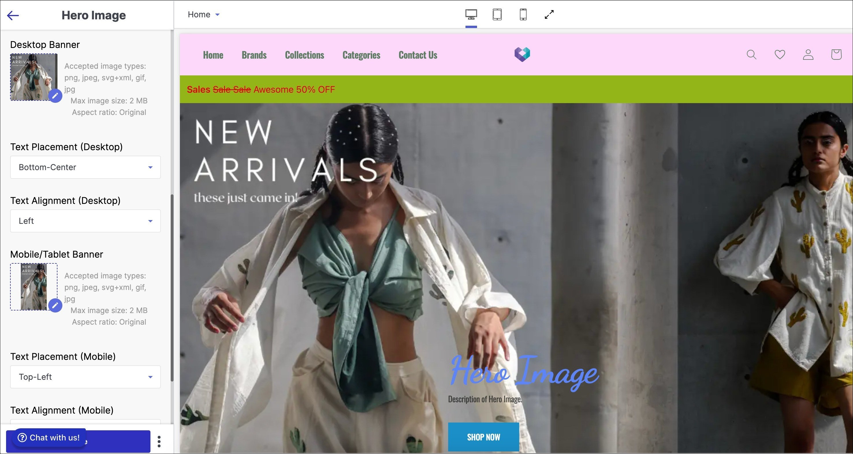
To upload a desktop banner on the website.
- Click ‘pen icon’ to upload image.
- Choose drag & drop, computer upload or URL.
- Desktop hero image aspect ratio is 16:9 (1440x810).
- Acceptable formats: png, jpeg, svg+xml, gif.
- Max file size: 2 MB.
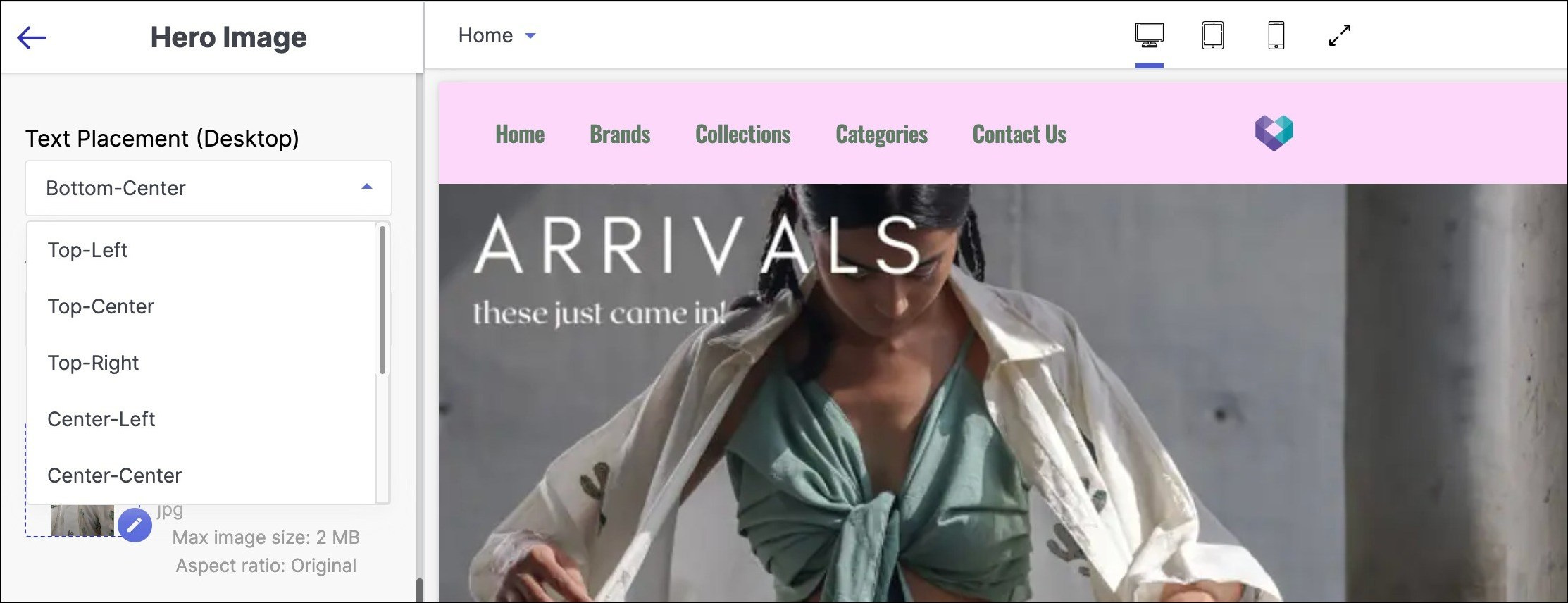
Text Placement (Desktop): Text placement for desktop refers to the strategic positioning of written content on website that is specifically designed to be viewed on a computer screen.
- Below are the steps to configure text placement for desktop:
- Click on the dropdown menu.
- Choose from various positions to place the text:
- Top center
- Top left
- Top right
- Center left
- Center center
- Center right
- Bottom left
- Bottom center
- Bottom right
- Below are the steps to configure text placement for desktop:
- Text Alignment (Desktop): Text alignment for desktop refers to the placement of text on a computer screen in relation to the left or right margin, or centered within a block of text.
- Below are the steps to configure text placement for desktop:
- Centre alignment
- Left alignment
- Right alignment
- Below are the steps to configure text placement for desktop:
- Mobile Banner: A mobile banner is a type of advertisement displayed on mobile devices, typically in the form of a rectangular or square graphic that appears within a mobile app or website.
- To upload a desktop banner on the mobile/tablet.
- Click ‘pen icon’ to upload image.
- Choose drag & drop, mobile/tablet upload or URL.
- Mobile hero image aspect ratio is 9:16 (320x569).
- Acceptable formats: png, jpeg, svg+xml, gif.
- Max file size: 2 MB.
- To upload a desktop banner on the mobile/tablet.
- Text Placement (Mobile/Tablet): Text placement for mobile/tablet refers to the strategic placement of written content, such as headlines, body copy, and calls-to-action, on a mobile device/tablet screen.
- Below are the steps to configure text placement for mobile/desktop:
- Click on the dropdown menu.
- Choose from various text placement positions, including:
- Top centre
- Top left
- Top right (tablet only)
- Centre left (tablet only)
- Centre centre
- Centre right (tablet only)
- Bottom left (tablet only)
- Bottom centre
- Bottom right (tablet only)
- Below are the steps to configure text placement for mobile/desktop:
- Text Alignment (Mobile/Tablet): Text alignment for mobile/tablet refers to the positioning of text within a mobile/tablet interface, such as an app or website, in relation to the screen's edges or other elements.
- Below are the steps to configure text placement for desktop:
- Centre alignment
- Left alignment
- Right alignment
- Below are the steps to configure text placement for desktop:
- Block
- Hotspot Desktop: Displays clickable hotspots on desktop view to highlight specific areas of an image or section for enhanced interactivity and engagement.
- Pointer: The pointer shape to be a circle pointer or a box.
- Show Clickable Area: Whether the clickable area to be shown or not.
- Horizontal Position: Set the horizontal position of the pointer on the banner image.
- Vertical Position: Set the vertical position of the pointer on the banner image.
- Width: Width of the box pointer as a measure of the banner width. Only applicable for box pointer type.
- Height: Height of the box pointer as a measure of the banner height. Only applicable for box pointer type.
- Hotspot Hover Image: Image to be displayed when the user hovers over the pointer. Only applicable for circular pointer type.
- Headers: Heading to be displayed when the user hovers on the hotspot. Only applicable for circular pointers.
- Description: Description to be displayed when the user hovers on the hotspot. Only applicable for circular pointers.
- Hover Link Text: Hover Link text to be displayed when the user hovers on the hotspot. Only applicable for circular pointers.
- Redirect Link: Redirect link to which the customer is redirected to when the user clicks on the hotspot. Only applicable for circular pointers.
- Hotspot Mobile: Displays clickable hotspots on mobile view to highlight specific areas of an image or section for enhanced interactivity and engagement.
- Pointer: The pointer shape to be a circle pointer or a box.
- Show Clickable Area: Whether the clickable area to be shown or not.
- Horizontal Position: Set the horizontal position of the pointer on the banner image.
- Vertical Position: Set the vertical position of the pointer on the banner image.
- Width: Width of the box pointer as a measure of the banner width. Only applicable for box pointer type.
- Height: Height of the box pointer as a measure of the banner height. Only applicable for box pointer type.
- Hotspot Hover Image: Image to be displayed when the user hovers over the pointer. Only applicable for circular pointer type.
- Headers: Heading to be displayed when the user hovers on the hotspot. Only applicable for circular pointers.
- Description: Description to be displayed when the user hovers on the hotspot. Only applicable for circular pointers.
- Hover Link Text: Hover Link text to be displayed when the user hovers on the hotspot. Only applicable for circular pointers.
- Redirect Link: Redirect link to which the customer is redirected to when the user clicks on the hotspot. Only applicable for circular pointers.
- Hotspot Desktop: Displays clickable hotspots on desktop view to highlight specific areas of an image or section for enhanced interactivity and engagement.
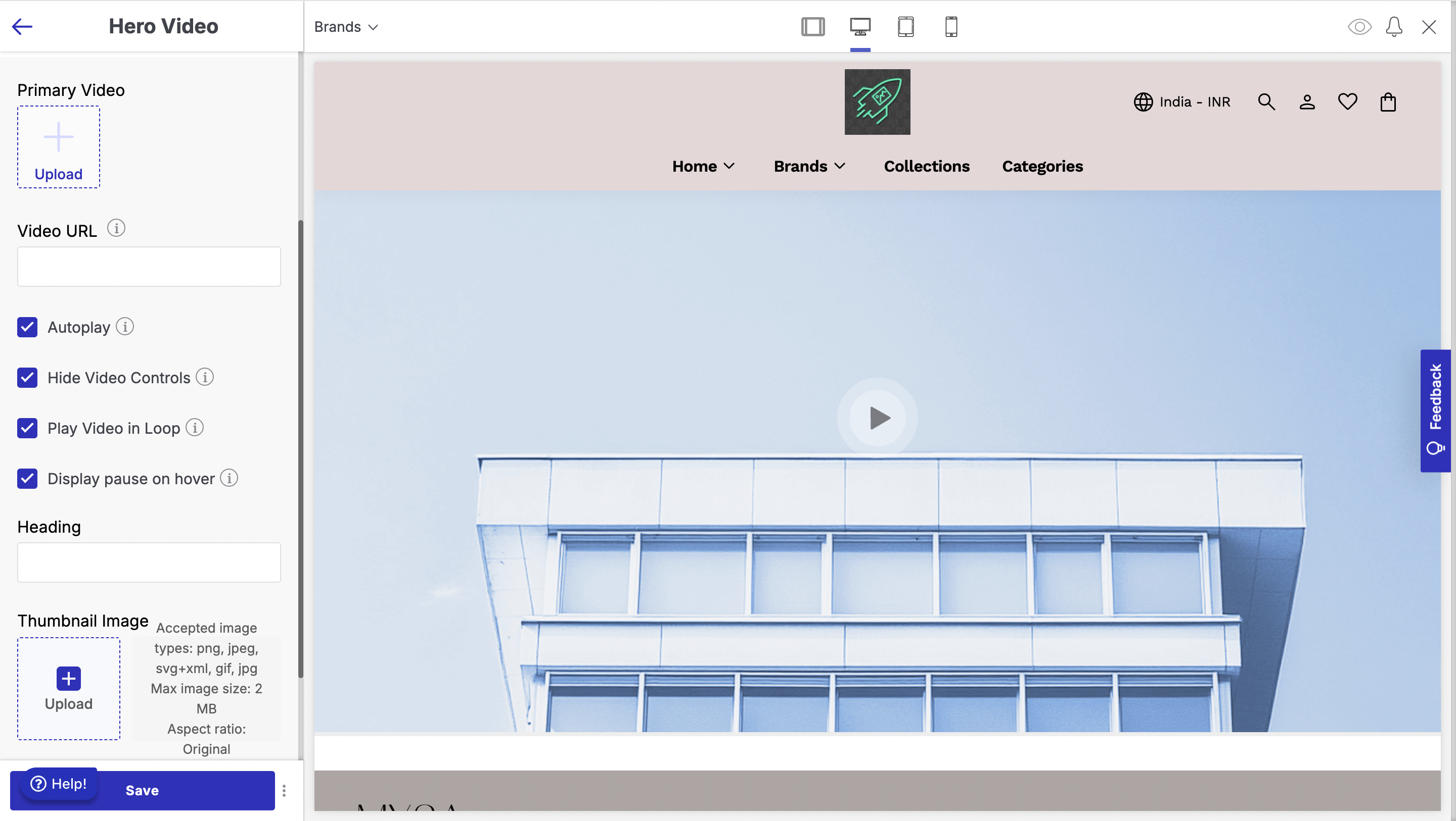
Hero Video
The Hero Video section lets you add an engaging video banner to your homepage, making your storefront more dynamic and interactive.
- Go to the appearance section of your theme and select 'Edit'.
- Click on 'Add Section' below the list of other sections on the left side of the screen.
- Select 'Hero Video' from the left sidebar.
Below are the configurations available:
- Primary Video: The video to be displayed.
- Video URL: The URL of the video to be displayed.
- Autoplay: Autoplay the video.
- Hide video controls: Enable or disable the video play controls.
- Play Video in loop: Set whether the video needs to be played on loop or not.
- Display pause on hover: Set whether the pause button needs to be displayed on hover.
- Heading: Heading to be displayed above the video in the section.
- Thumbnail Image: Thumbnail image of the video.
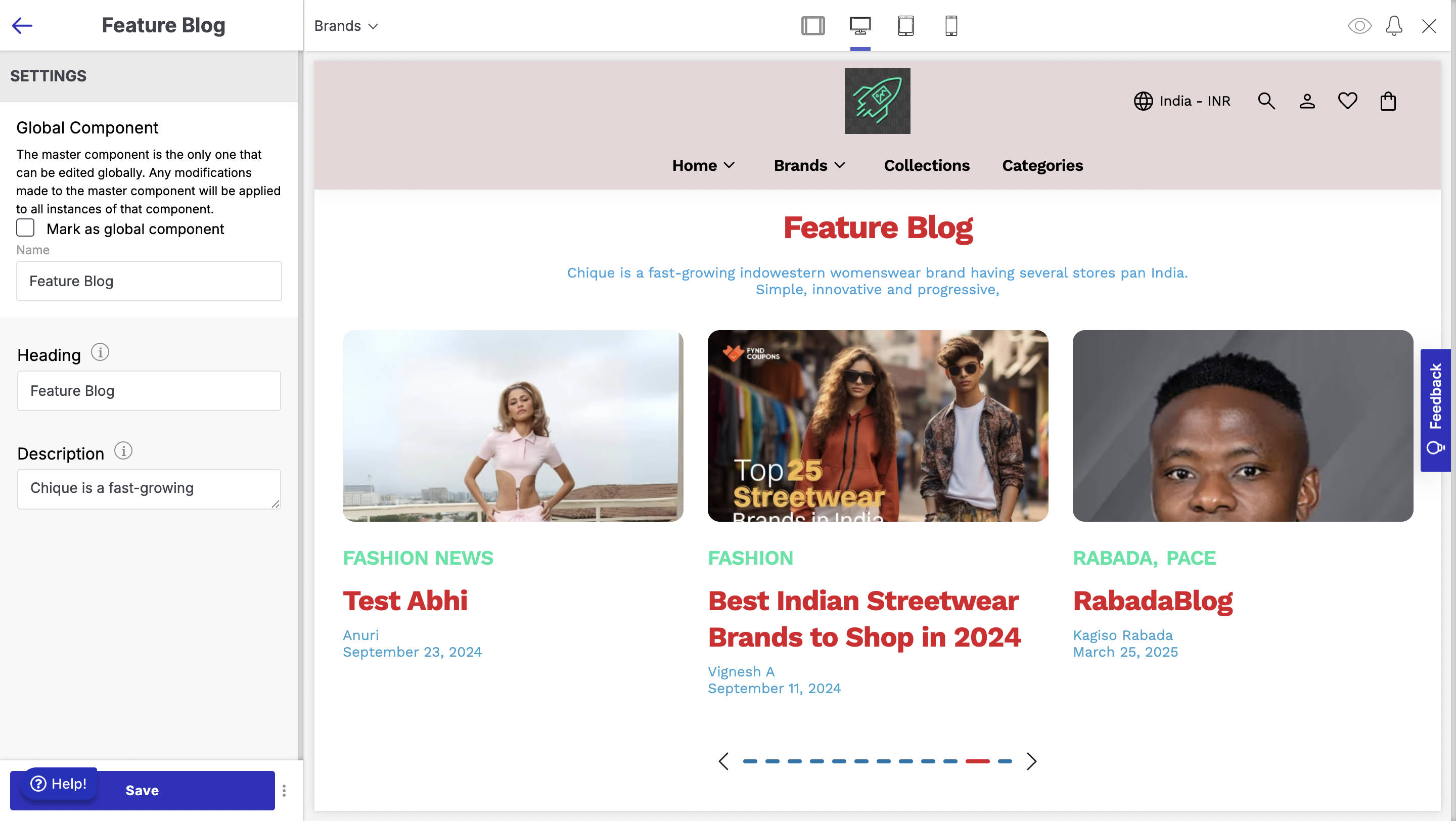
Feature Blog
The Feature Blog section lets you showcase your latest blog posts on your storefront
- Go to the appearance section of your theme and select 'Edit'.
- Click on 'Add Section' below the list of other sections on the left side of the screen.
- Select 'Feature Blog' from the left sidebar.
Below are the configurations available:
- Heading: Heading to be displayed above the blog cards in the section.
- Description: Description to be displayed above the blog cards in the section.
Image Gallery
This section allows merchants to showcase products using image gallery
To add a image gallery section to your website:
- Go to the appearance section of your theme and select 'Edit'.
- Click on 'Add Section' below the list of other sections on the left side of the screen.
- Select 'Image Gallery' from the left sidebar.
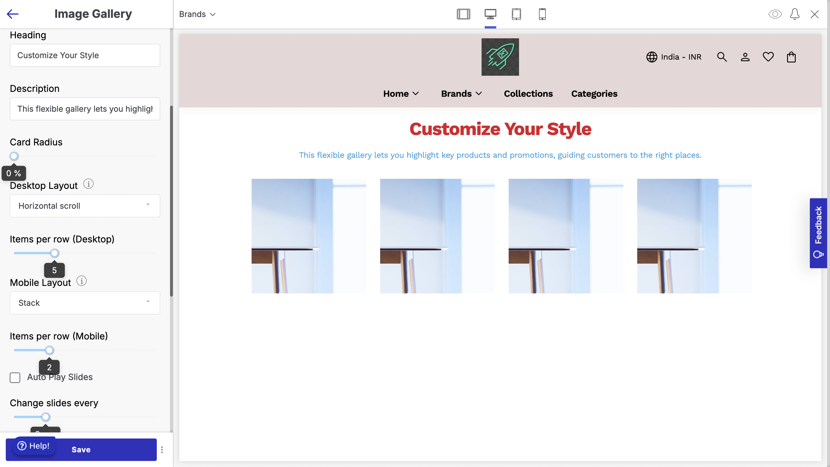
Below are the configurations available
- Heading: Heading to be displayed above the image cards in the section.
- Description: Description to be displayed above the image cards in the section.
- Card Radius: Set the card radius.
- Desktop Layout: Set the layout in desktop screens - stack or horizontal scroll.
- Items per row Desktop: Set the image cards per row to be displayed in desktop screens.
- Mobile Layout: Set the layout in mobile screens - stack or horizontal scroll.
- Items per row Mobile: Set the image cards per row to be displayed in mobile screens.
- Autoplay slides: Set whether the auto scroll for the image cards needs to set.
- Change slides every: Set the time interval after which auto scroll needs to happen.
- Blocks
- Image Card - Add the image and where it needs to redirect to.
Image Slideshow
An Image Slideshow is a section on a website that displays a series of images or slides that automatically transition to capture the user's attention and encourage further exploration of the website.
To add a image slideshow section to your website:
- Go to the appearance section of your theme and select 'Edit'.
- Click on 'Add Section' below the list of other sections on the left side of the screen.
- Select 'Image Slideshow' from the left sidebar.
- Below are the configurable options of the image slideshow section:
- Auto Play Slides: Auto play slides in an image slideshow refer to the automatic transition of images in the slideshow without requiring user input. Use this option to allow a slideshow to start playing automatically, without the need for manual control.
- Change slides every: "Change slides every" in an image slideshow refers to the time duration between each transition of slides in the slideshow. It determines how long one slide will be displayed before the slideshow automatically switches to the next slide. Use this option that allows you to set the time duration for automatic slide transitions.
- Blocks: In an image slideshow, blocks refer to the individual units or sections that contain the images being displayed. Each block typically contains one image, and the slideshow transitions between these blocks to create a dynamic visual display.
- Below are the steps to configure blocks in image slideshow:
- Click "Add Block"
- Choose an option to add an image:
- Desktop Image: Upload image for desktop site.
- Mobile Image: Upload image for mobile site.
- Slide Link: Add web address to image for redirection.
- Below are the steps to configure blocks in image slideshow:
Featured Collection
The Featured Collection section allows you to highlight products of a specific collection
To add a Featured Collection section to your website:
- Go to the appearance section of your theme and select 'Edit'.
- Click on 'Add Section' below the list of other sections on the left side of the screen.
- Select 'Featured Collection' from the left sidebar.
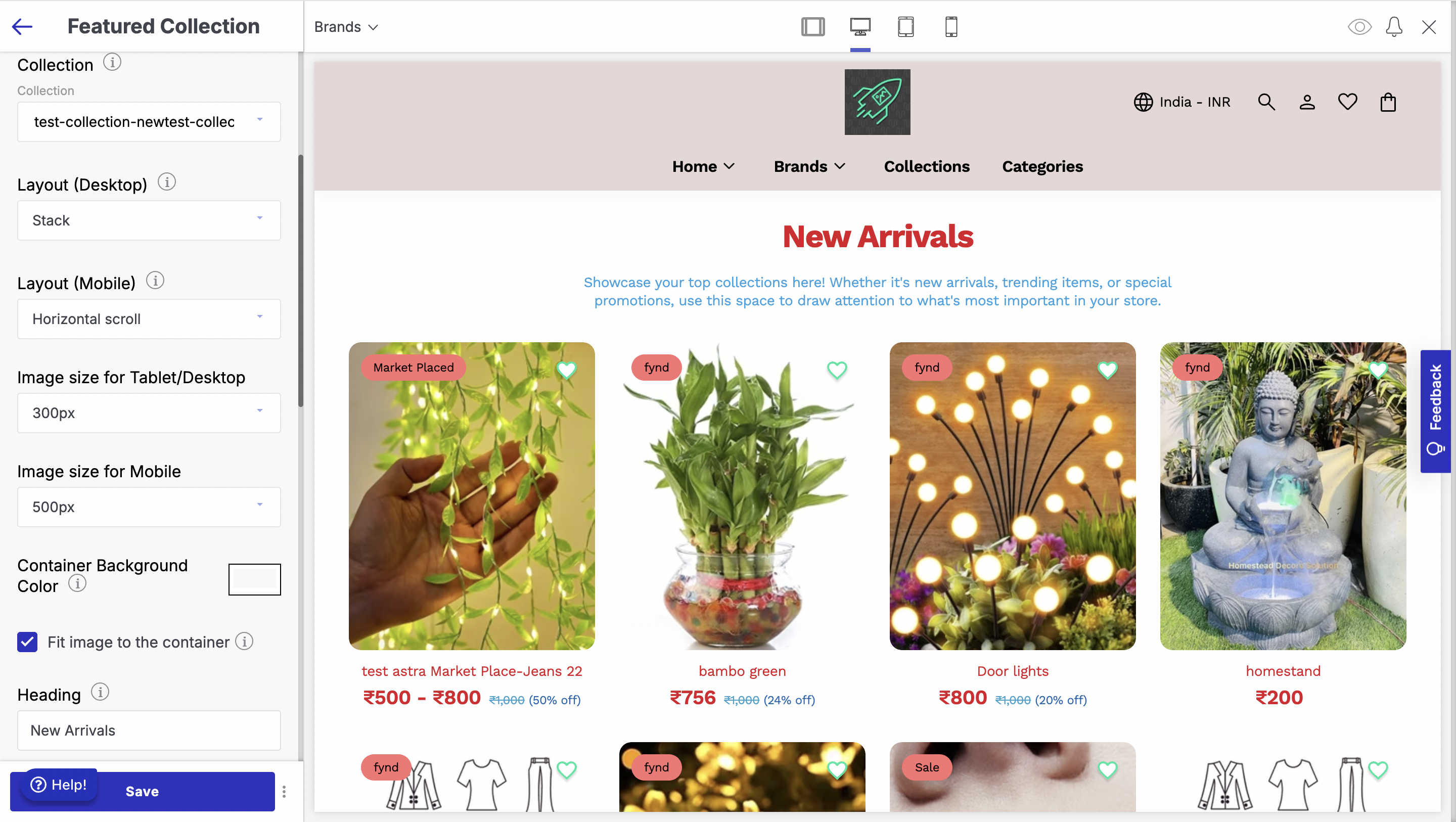
Below are the configurations available
- Collection: Select the collection whose products need to be displayed.
- Layout Desktop: Select the layout on desktop screens - horizontal scroll, stack or banner with horizontal carousel.
- Layout Mobile: Select the layout on mobile screens - horizontal scroll, stack, banner with stack or banner with horizontal carousel.
- Image size for Tablet/Desktop: Select the image size using the image width for the product cards in desktop screens.
- Image size for Mobile: Select the image size during the image width for the product cards in mobile screens.
- Container Background Colour: Select the colour for the background in the container for the product cards.
- Fit Image to Container: Fit image to container.
- Heading: Heading to be displayed above the product cards in the section.
- Description: Description to be displayed above the product cards in the section.
- Text Alignment: Set the horizontal alignment for heading and description.
- Button Text: Text to be displayed on the button.
- Products per Row Desktop: Set the products per row for desktop screens.
- Products per Row Mobile: Set the products per row for mobile screens.
- Maximum Products to show: Set the maximum number of products to be shown in the section.
- Show Add to Cart: Show Add to Cart button in the product cards.
- Show Wishlist icon: Show wishlist icon on the product cards.
- Show Badge: Show the badge on the product cards.
- Show View All Button: Show VIew All button.
- Mandatory Delivery Check: Enable mandatory delivery check when user adds the product to cart directly from this section.
- Hide Single Size: Hide size selection when only size is available in add to cart popup.
- Preselect size: Preselect size in the add to cart popup.
Brands Listing
Brand Listing on a website is a section that displays logos, names and perhaps products of different brands that are associated with the website or the products and services offered on the website. It's often used to showcase the website's partnerships, collaborations, or authorised reseller status.
To add brands listing section to your website:
- Go to the appearance section of your theme and select 'Edit'.
- Click on 'Add Section' below the list of other sections on the left side of the screen.
- Select 'Brands Listing' from the left sidebar.
Below are the configurable options of the brands listing section:
- Display brands per row (desktop): "Display brands per row (desktop) in brands listing" refers to the number of brand logos or images that are displayed in a single row on a desktop screen when browsing a list of brands. Using the slider number line, select the number of brands you want to keep in a single row of each brands listing category. The minimum and maximum numbers of goods product items are 3 and 5, respectively.
- Logo Only: A logo-only listing in a brands listing refers to a display of only the logo of a brand, without any accompanying text or information. Tick the Logo Only checkbox if you want to display the logo of the brands in your Brands Listing section.
- Mobile Layout: Mobile Layout in brands listing refers to the arrangement and design of the brand logos or names on the mobile version of a website or application. It determines how the brands are visually displayed to the user, including factors such as size, spacing, and alignment.
- Steps to configure Layout (Mobile) in your brands listing:
- Select alignment from Layout dropdown: Stacked or Horizontal.
- Stacked view: product items in column or row for simplified interface.
- Horizontal scroll: product items in scrolling list horizontally.
- Steps to configure Layout (Mobile) in your brands listing:
- Desktop Layout: In a brands listing, the Desktop Layout refers to the way in which the brand logos or names are displayed on a desktop or laptop screen. It may include the arrangement, spacing, size, and order of the logos/names, as well as any visual or design elements that are used to highlight or differentiate the brands.
- Steps to configure Layout (Desktop) in your brands listing:
- Select 'Stacked' or 'Horizontal' alignment from Layout dropdown.
- 'Stacked' view offers a simplified interface for arranging content in a column or row.
- 'Horizontal' scroll shows product items in a horizontal scrolling list.
- Steps to configure Layout (Desktop) in your brands listing:
- Align Brands: Align the brand name on the card to the left, right, center on the card
- Container Background Colour: Container Background colour refers to the colour that is applied to the background of a container element in a website or application. Use this option to modify the container background colour of the featured collection section of your store.
- Fit image to the container: "Fit image to the container" is a term used in web design and development that refers to the process of adjusting an image's size and dimensions to fit within its designated container element on a webpage. Check the Fit image to the container tick-box if you want the aspect of the image to fit in alignment with the container.
- Heading: The Heading of a brands listing is a text element that is typically placed on top of the image in the brands listing of a website's Home page. It is a short and catchy text element that conveys the website's main message or value proposition to visitors.
- Description: The Description of a brands listing is a text element that is typically placed below the Heading in the brands listing of a website's Home page. It usually consists of a short paragraph that provides additional information about the website's main offering, product, or service.
- Button Text: Button text in brands listing refers to the text displayed on the button that allows users to interact with a particular brand within the listing. Enter the title you want to put in your button text, to enable the user to allow users to tap once to look at options after entering a string and make a decision. Your button text could be named as ‘View all brands’, or “Explore more brands’.
- Blocks: In the context of brand listings, blocks refer to sections or areas where different brands are displayed together. These blocks can be categorised based on different criteria, such as product type, brand popularity, or price range.To add a block to your theme, click on the ‘Add block’ button right below the BLOCKS section in the left sidebar. Then, from the search brand dropdown menu, choose a brand item or add another block.
Testimonial
The Testimonial section on a website displays feedback from previous customers to build trust and encourage potential customers to take action. This document outlines how to establish the Testimonials component of your store. Employ the section to present a textbox with reviews of your store's products and offerings from users, partners, and employees.
To add a testimonial section to your website:
- Go to the appearance section of your theme and select 'Edit'.
- Click on 'Add Section' below the list of other sections on the left side of the screen.
- Select 'Testimonial' from the left sidebar.
- Below are the configurable options of the testimonial section:
- Heading: In a testimonial section, a heading typically refers to a title or headline that introduces and summarises the content of the testimonial section. In the title text field, enter the title to be displayed as the primary heading of your testimonial section.
- AutoPlay Slides: Auto play slides in a testimonial section refer to the automatic transition of images in the slideshow without requiring user input. Check the AutoPlay slides tick-box if you want to display automatic advance to the next slide in your Testimonials section.
- Change slides every: "Change slides every" in a testimonial section refers to the time duration between each transition of slides in the slideshow. It determines how long one slide will be displayed before the slideshow automatically switches to the next slide. Use this option that allows you to set the time duration for automatic slide transitions. The number of seconds range from 1 second to 10 seconds.
- Blocks: Blocks in the testimonial section of a website refer to the individual sections or units that display each testimonial.
- Below are the steps to configure blocks in testimonial:
- Click 'Add block' below the BLOCKS section in the sidebar.
- Select 'Testimonial' from the search brand dropdown menu.
- Fill in the details including an image.
- Accepted image types: png, jpeg, svg+xml, gif.
- Max image size: 2 MB.
- Image: Image to be displayed on the testimonial
- Testimonial: Testimonial to be displayed
- Author Name: Author name in the testimonial section of a website refers to the name of the person who provided the testimonial. Add the name of the author who has written the testimonial.
- Author Description: An author description in the testimonial section of a website is a brief statement that provides context about the person who provided the testimonial. Write a brief description about the author.
- Below are the steps to configure blocks in testimonial:
Link
The Link section lets you easily add clickable links to your page, making it simple for visitors to navigate to other parts of your storefront
To add a link section to your website:
- Go to the appearance section of your theme and select 'Edit'.
- Click on 'Add Section' below the list of other sections on the left side of the screen.
- Select 'Link' from the left sidebar.
Media with Text
This section lets you display a section with text and images in a visually appealing layout. This feature is great for creating attention-grabbing sections with both media and text, perfect for highlighting key messages or calls to action
To add a Media with Text section to your website:
- Go to the appearance section of your theme and select 'Edit'.
- Click on 'Add Section' below the list of other sections on the left side of the screen.
- Select 'Media with text' from the left sidebar.
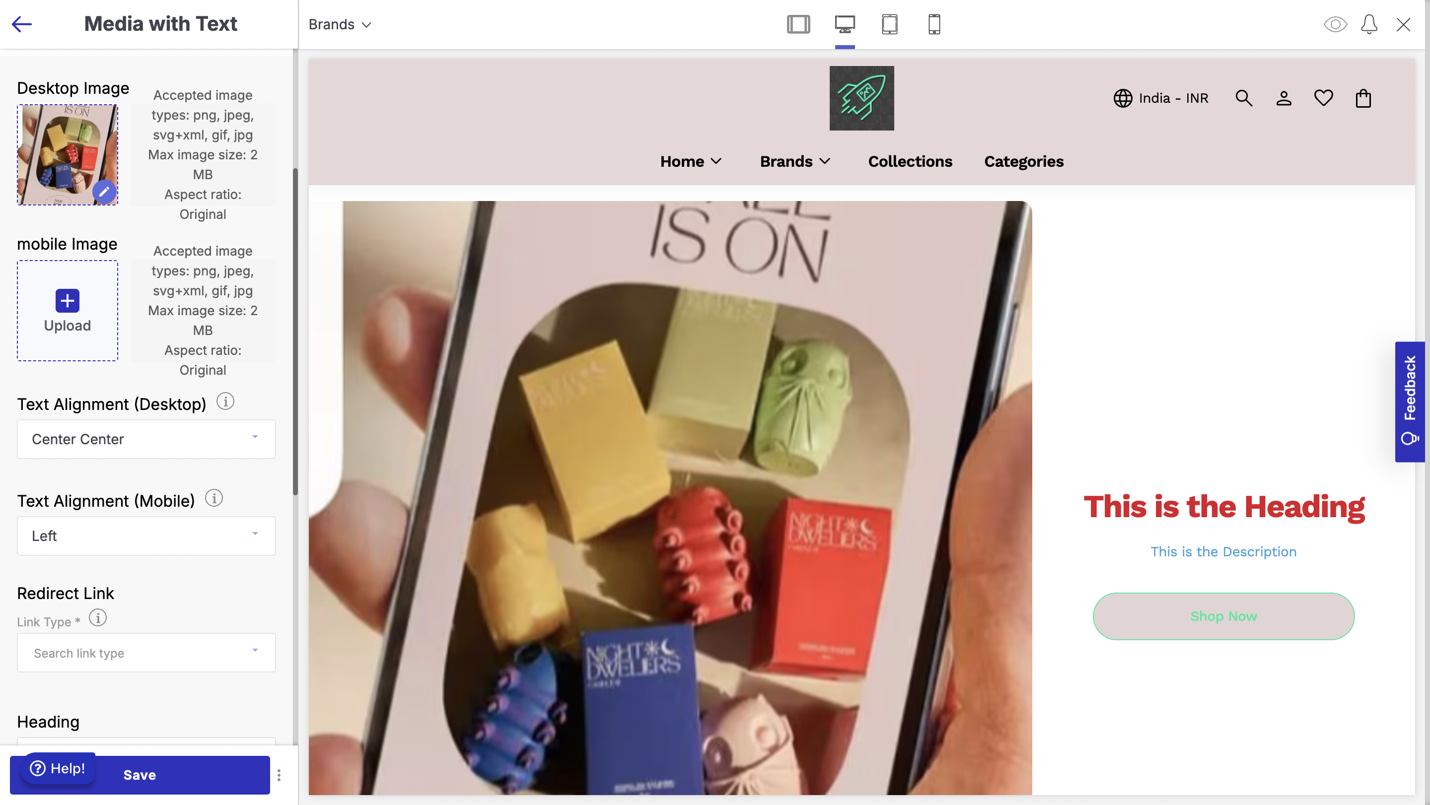
Below are the configurations available
- Desktop Image: Image to be displayed in desktop screens.
- Mobile Image: Image to be displayed in mobile screens.
- Text Alignment Desktop: Set the horizontal and vertical alignment of the text to be displayed.
- Text Alignment Mobile: Set the horizontal alignment of the text to be displayed.
- Redirect Link: Set the link to which the button needs to redirect the customer to.
- Heading: Heading of the text to be displayed.
- Description: Description of the text to be displayed.
- Button Text: Ttext to be displayed on the button in the section.
- Invert Section: Invert the position of the image and the text.
Multi Collection Product List
The Multi Collection Product List section lets you showcase multiple product collections in a clean, organized layout. This section is perfect for displaying several product collections at once, with easy navigation and customizable display options
To add a Multi Collection Product List section to your website:
- Go to the appearance section of your theme and select 'Edit'.
- Click on 'Add Section' below the list of other sections on the left side of the screen.
- Select 'Multi Collection ' from the left sidebar.
Below are the configurations available
- Heading: Heading to be displayed above the product cards.
- Products per Row: Set the product cards to be displayed per row.
- Header position: Set the position of the header - left or center.
- Image size for Tablet/Desktop: Set the image size for the product card to be displayed in desktop screens.
- Image size for Mobile: Set the image size for the product card to be displayed in mobile screens.
- Show View All: Show view all button.
- Fit Image to Container: Fit Image to Container for the product card.
- Show Wishlist icon: Show wishlist icon on the product card.
- Show Add to Cart: Show Add to Cart button for the product card.
- Mandatory Delivery Check: Delivery serviceability check to be made mandatory when customer adds the product to cart through the "Add to Cart" button.
- Hide single size: Size to be hidden for single size products in Add to Cart popup.
- Preselect size: Preselect size in Add to Cart popup.
- Block
- Navigation: Select the collection whose product cards to be displayed.
- Icon: Icon to be displayed.
- Navigation Name: Name of the navigation.
- Collection: Select the collection whose products to be displayed.
- Button Link: Link to which the customer to be redirected to on clicking the button.
- Navigation: Select the collection whose product cards to be displayed.
Custom HTML
The Custom HTML section allows you to add your own HTML code to customize the page further.
To add a Custom HTML section to your website:
- Go to the appearance section of your theme and select 'Edit'.
- Click on 'Add Section' below the list of other sections on the left side of the screen.
- Select 'Custom HTML ' from the left sidebar.
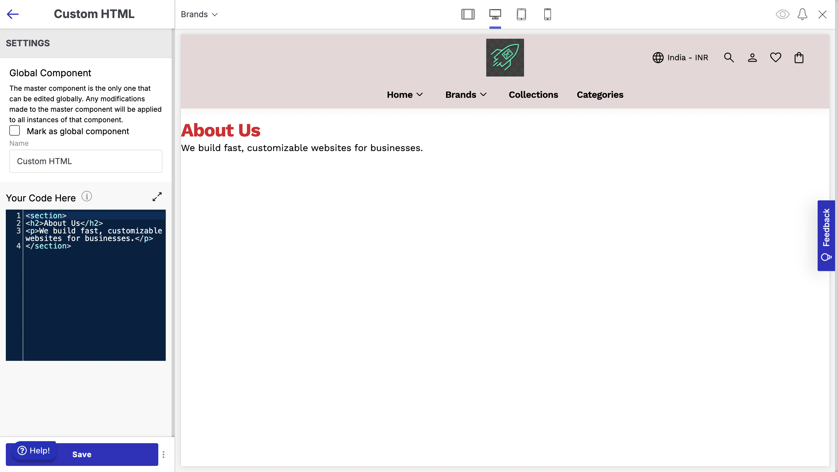
Below are the configurable options:
- Custom HTML: Paste your HTML code here.
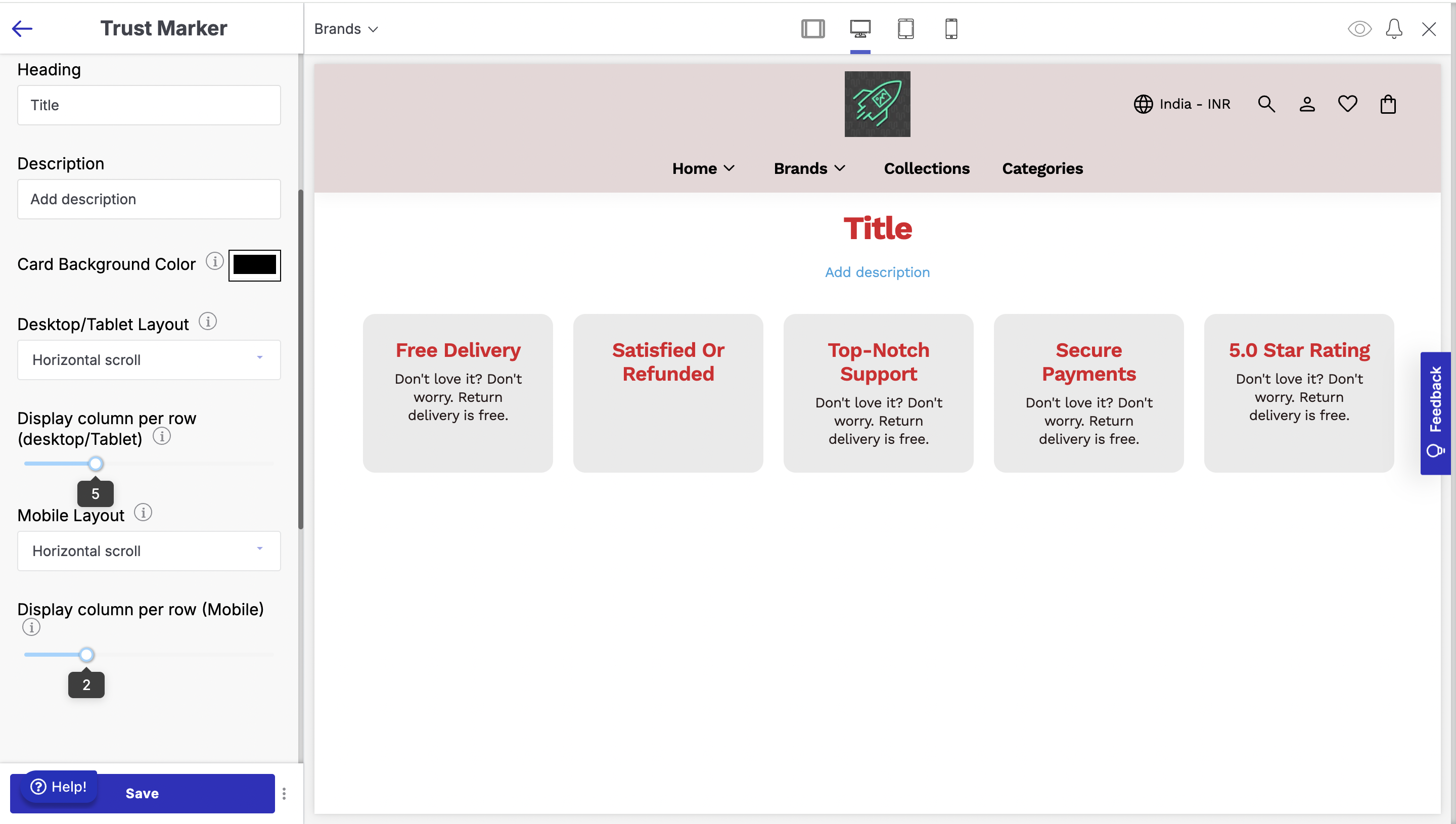
Trust Marker
This section is ideal for building trust and credibility with your audience by displaying important markers like certifications, security badges, or partnerships in a clean and flexible layout.
To add a Trust Marker section to your website:
- Go to the appearance section of your theme and select 'Edit'.
- Click on 'Add Section' below the list of other sections on the left side of the screen.
- Select 'Trust Marker ' from the left sidebar.
Below are the configurations available:
- Heading: Heading to be displayed above the trust markers.
- Description: Description to be displayed above the trust markers.
- Card Background Colour: Set the card background colour.
- Desktop/Tablet Layout: Set the layout in desktop screens - stack or horizontal scroll.
- Display column per row (Desktop/Tablet): Number of trust markers to be displayed per row in desktop screens.
- Mobile Layout: Set the layout in mobile screens - stack or horizontal scroll.
- Display column per row (Mobile): Number of trust markers to be displayed per row in mobile screens.