Settings
General Settings
The general settings encompass the foundational colour palette of the Arlo theme. Customise colours to create a cohesive design that resonates with your brand identity.
1. Theme
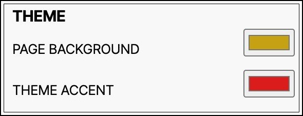
- Page Background
Adjust the background colour of your website's main content area, excluding the header and footer, to enhance visual appeal.
- Theme Accent
Customise the accent colour used to highlight important elements such as sub-menus and product description backgrounds.
2. Text Settings
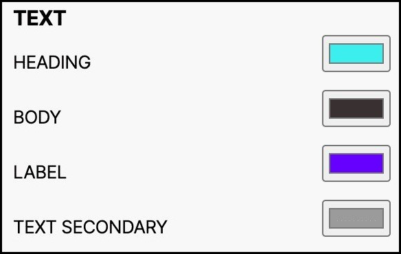
Customise text colours throughout your website to ensure readability and visual consistency.
- Heading
Modify the colour of main headings and titles to grab users' attention.
- Body
Change the colour of main text content including paragraphs, lists, and other elements.
- Label
Adjust the colour of text used for product descriptions, pricing information, and other product-related details.
- Text Secondary
Modify the colour of text that appears on inactive buttons, links, or fields to create clear visual hierarchy.
3. Button Settings
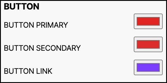
Customise button colours to guide user interactions effectively.
- Primary Button
Modify the primary colour for essential actions like checkout and view more buttons.
- Secondary Button
Adjust the colour of non-primary actions such as "Add to Cart" buttons.
- Button Link
Modify the colour of standalone text links that navigate online content.
4. Discount Settings
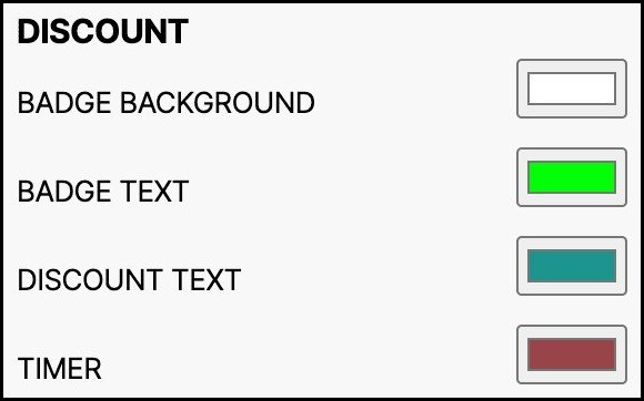
Customise discount badge colours to visually communicate price reductions.
- Badge Background
Modify the background colour used to display the price of products before discounts.
- Badge Text
Adjust the badge text colour used to indicate status or actions related to products.
- Discount Text
Change the colour used to display the percentage of discounts on products.
- Timer
Modify the colour of timers that display countdowns for time-limited offers.
5. Header Settings

Customise the header section to represent your website's identity and facilitate navigation.
- Header Background
Adjust the background colour behind the header section to provide visual coherence.
- Navigation Text
Change the colour of links or menu options displayed in the header section.
- Icons
Modify the colour of icons displayed in the header, such as search, shopping cart, and menu icons.
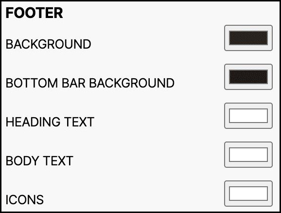
6. Footer Settings
Customise the footer section to provide essential information and enhance user experience.
- Background
Adjust the background colour of the footer section to create a visually appealing layout.
- Bottom Bar Background
Change the background colour of the bottom bar to enhance visual continuity.
- Heading Text
Modify the colour of text used for headings in the footer section.
- Body Text
Adjust the colour of main text content in the footer, including copyright notices and contact information.
- Icons
Change the colour of icons displayed in the footer, such as extension icons, shopping cart icons, and menu icons.
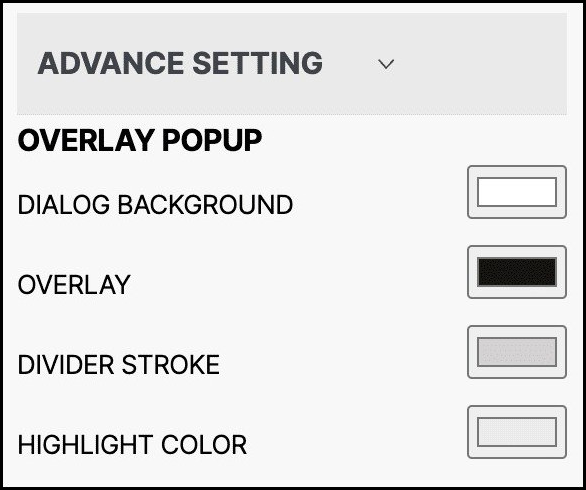
7. Overlay Popup Settings
Customise overlay popup colours to create visually appealing dialogues.
- Dialog Background
Modify the background colour of dialogues in overlay popups for contrast and focus.
- Overlay
Adjust the colour of overlays displayed on top of existing webpage content for emphasis.
- Divider Stroke
Change the colour of divider strokes that separate different sections within overlay popups.
- Highlight Colour
Modify the colour used to draw attention to specific elements or messages in overlay popups.
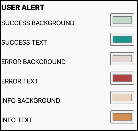
8. User Alert Settings
Customise colours for user alerts, notifications, and messages.
- Success Background/Success Text
Modify colours used to indicate successful actions or operations on the website.
- Error Background/Error Text
Adjust colours used to indicate errors or warnings on the website.
- Info Background/Info Text
Change colours used to indicate general information or notifications on the website.
9. Font Settings
Customise font options to enhance readability and visual appeal.
- Font Header
Choose the typeface for main headings or titles on your website.
- Font Body
Select the primary typeface for main content on your website, such as paragraphs and articles.
10. Authentication Settings
Customise the header and footer appearance on authentication pages.
- Show Header
Enable the display of the header during the login screen.
- Show Footer
Enable the display of the footer during the login screen.
11. Extension Positions
Customise where browser extensions or add-ons are displayed on your website.
- Header Top
Display extensions at the top of the header section.
- Header Bottom
Display extensions at the bottom of the header section.
- Footer Top
Display extensions at the top of the footer section.
- Footer Bottom
Display extensions at the bottom of the footer section.
Typography Settings
Customise typography to enhance readability and visual aesthetics.

- Font Header
Choose the typeface for main headings or titles throughout your website.
- Font Body
Select the primary typeface for main content on your website, ensuring readability.
Header Customisation
Customise the header appearance to represent your brand and improve user experience.
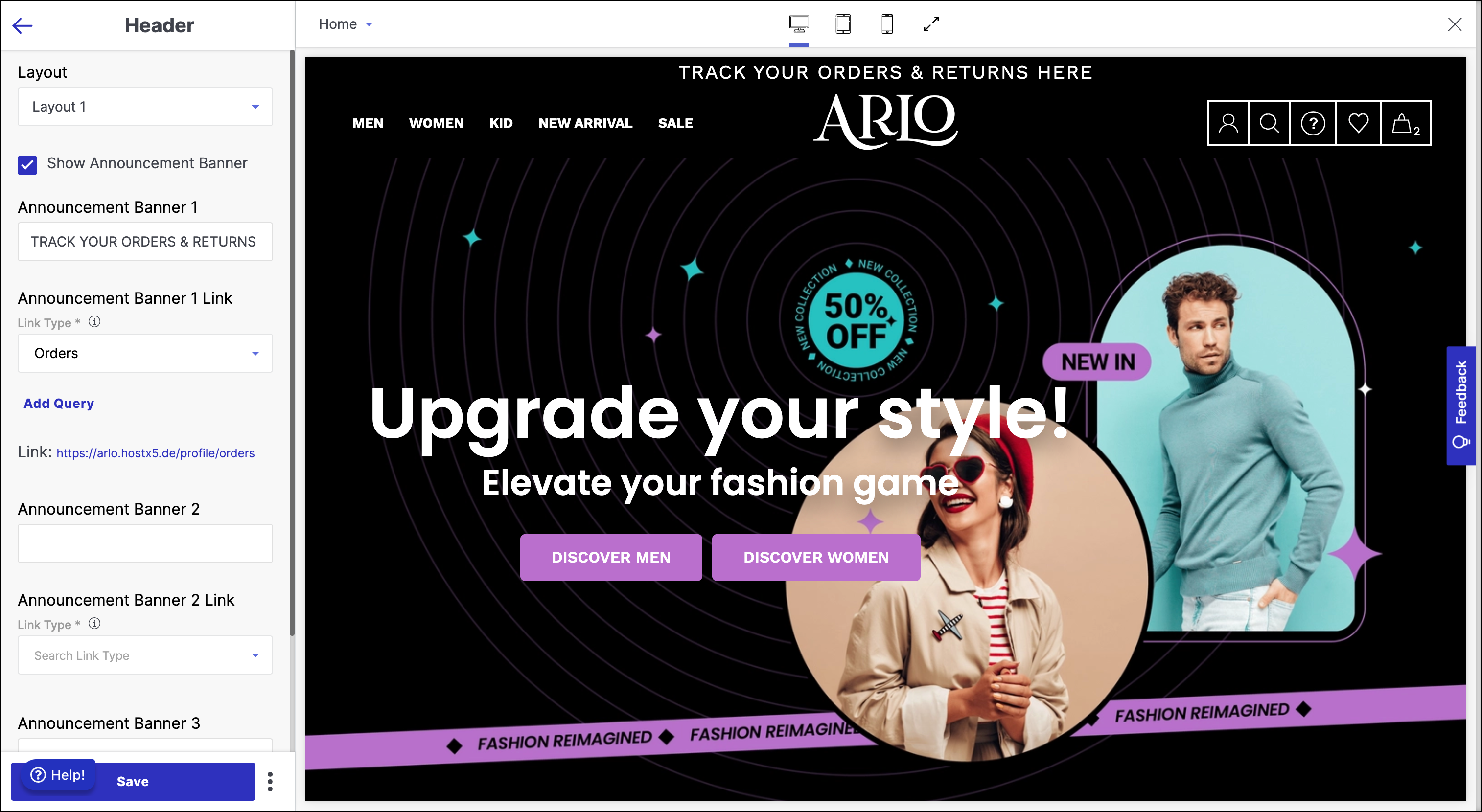
- Large Logo
Upload the large logo image that appears prominently in the header section.
- Small Logo
Upload the small logo image that represents your brand in the header.
Cart Settings
Customise the cart icon and its functionality.
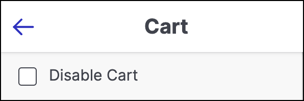
- Disable Cart
Check to disable the cart icon from the menu items in the header section.
Footer Settings
Customise the footer appearance and content.
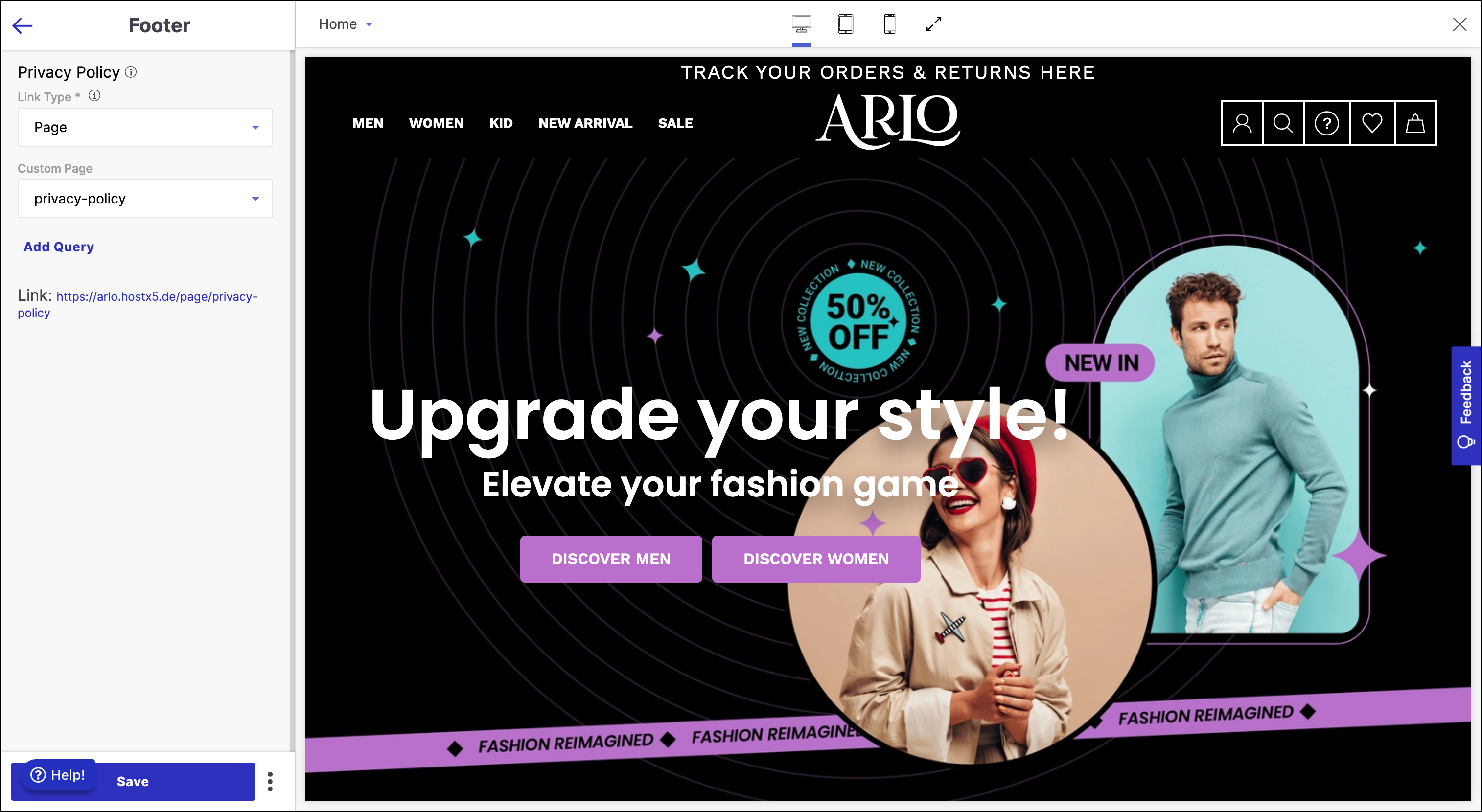
- Description
Add a brief description and important details about your business in the footer.
- Margin Above Footer
Adjust the space between the bottom of the main content and the top of the footer.
Configuration Settings
The Arlo Theme offers a range of powerful configuration settings that allow you to tailor the appearance and layout of your website to meet your preferences and create a visually appealing and user-friendly online presence.
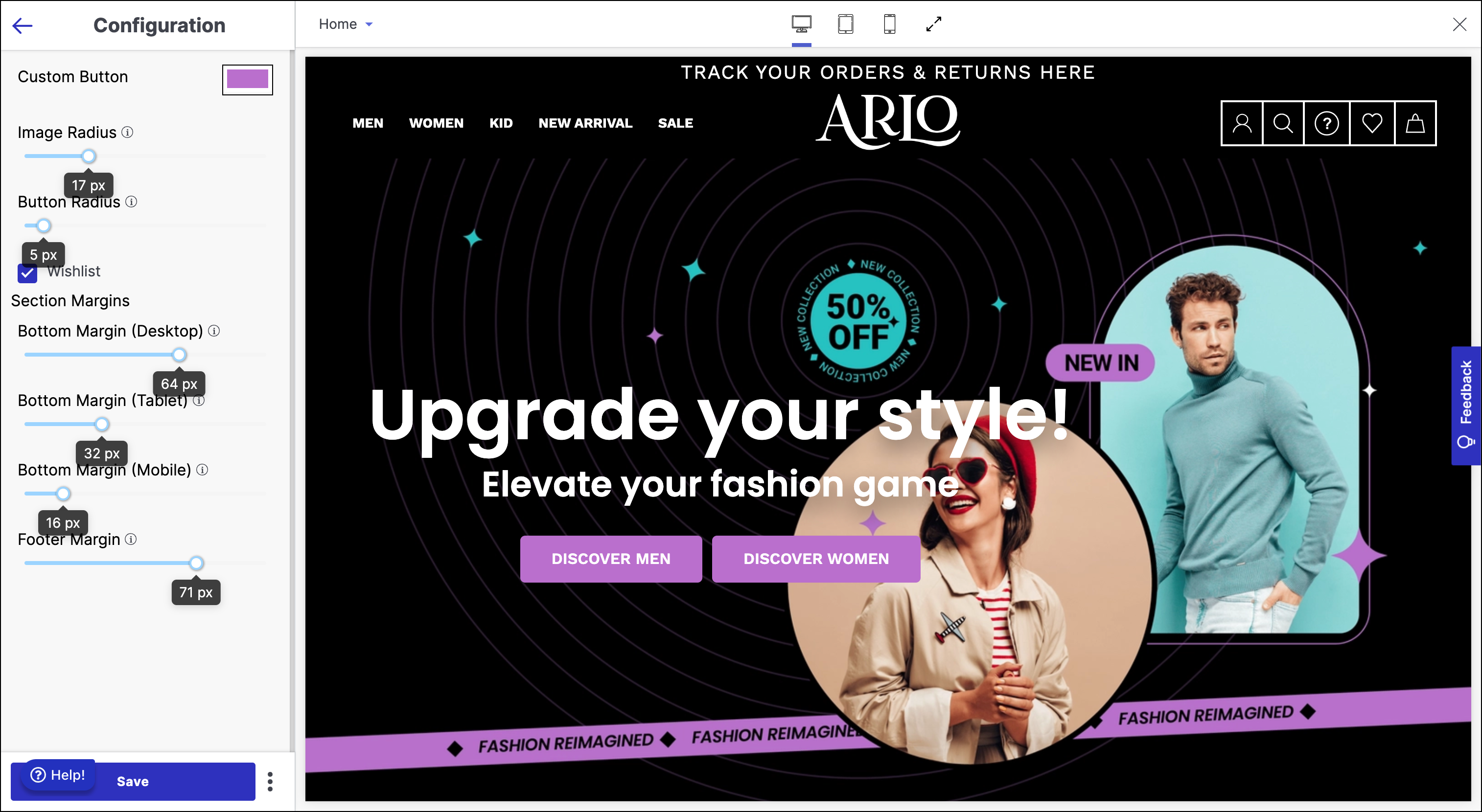
Custom Button
Image Radius
Adjust the image radius to achieve the desired level of image curvature. This setting lets you fine-tune the roundness of images within buttons. You can set the image radius between 0px and 64px, providing flexibility in button design.
Button Radius
Control the button radius to determine the curvature of buttons. This customisation option allows you to achieve the desired button shape and style. You can adjust the button radius within the range of 0px to 64px.
Wishlist
Enable the Wishlist checkbox to integrate a wishlist feature into your website. Enabling this option provides users with the ability to add products to a wishlist, enhancing their shopping experience.
Section Margins
Configure the margins between sections on your website, optimising the spacing for different devices and screen sizes. You can customize the following margin settings:
- Bottom Margin (Desktop): Adjust the space between sections on the homepage for users accessing your website from desktop devices.
- Bottom Margin (Tablet): Modify the vertical space between sections for users viewing your website on tablets.
- Bottom Margin (Mobile): Customise the spacing between sections for users browsing your website on mobile devices.
- Footer Margin: Set the margin between the last section of your homepage and the footer. This ensures a visually balanced layout.